Previous: Loaded for bear (27)
Next: An open letter to Jake Chapman (43)
Donatello
Post #954 • February 7, 2007, 12:12 PM • 11 Comments
Donatello, currently on display at Donatello to Giambologna at the MFA. Let's just look today, shall we?
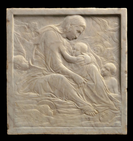
Donatello (Italian, 1386-1466), Madonna of the Clouds, Italian (Florence), Renaissance, about 1425-35, marble, Museum of Fine Arts, Boston, gift of Quincy Adams Shaw through Quincy Adams Shaw, Jr. and Mrs. Marian Shaw Haughton, photograph © Museum of Fine Arts, Boston
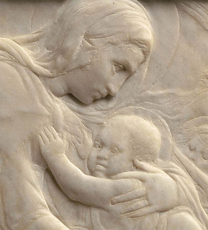
detail
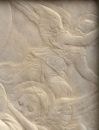
detail
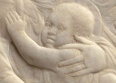
detail
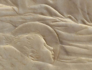
detail
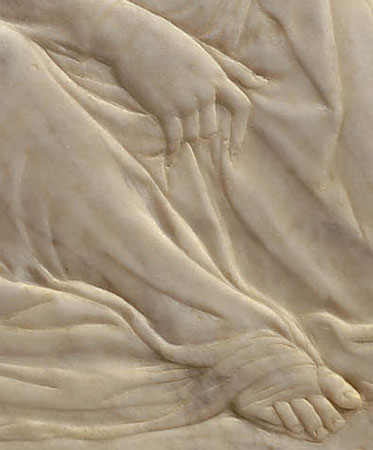
detail
2.
February 7, 2007, 1:15 PM
alot of things look a little off. Donatello, shmonatello!
3.
February 7, 2007, 11:35 PM
Relief is an incredibly difficulty mode to pull off successfully, and in marble even more so. I think Madonna of the Clouds is successful, inspite of a few little awkward details. I'll bet the surface varies from the level by no more than 3/4's of an inch from bottom to top, while the implied depth is probably more accurately measured in yards. It may be accurate that on close inspection the Christ-child's head appears a little wobbly, like a peeled hard-boiled egg, but try rendering a sphere in relief that shallow sometime - and in a hard material with no margin for error.
All parts of the image lead effectively back to the mother-Mary. The zigzag that starts at the bottom left works its way back and forth between imperfect cherubheads up to the wonderfully fraught and future-seeing gaze of the Madonna.
What kind of perfection is Eddie looking for, I wonder.
4.
February 8, 2007, 12:10 AM
The carving is barely one foot by one foot, I've just discovered. My guess of 3/4 inch depth is probably an overestimation - try a 1/2 inch maximum depth, with the child's head maybe modeled in 1/16 inch of marble. Shmonatello my ass.
5.
February 8, 2007, 12:25 AM
eddie - your joking right ?
6.
February 8, 2007, 9:40 AM
When someone says something sufficiently foolish, it's probably best to ignore it.
7.
February 8, 2007, 1:06 PM
I'll second that.
8.
February 8, 2007, 1:31 PM
Don't get me wrong - its an amazing thing, just a fantastic ceation of space from almost nothing. The Madonna's finger positions are really good to look at.
9.
February 9, 2007, 12:22 AM
Oh right. We were just supposed to look this time. Just shut up and look. Right. Next time for sure.
10.
February 9, 2007, 4:43 AM
Line, economy of form and value, composition, and format. This could be an etching, drawing, painting or as is... relief. Isn't it iinteresting that it is called a relief ?
11.
February 17, 2007, 9:42 AM
Its a amazing thing-at least in the context of what formal issues were important to artists and their public at the time .We re not that interested in relief carving now tho there are some great deco-esque ones at Rockefeller center, but the Egyptians were amazing at it and the Greeks used it on their temple pediments-in this case like the later Roman Sarcophagii it sometimes wound up climaxing into full relief.
This piece uses several repetitious lines to suggest depth in a (as remarked on above) relatively shallow degree of actual relief(at least as compared to it s stylistic forbears above)these swirling lines dont really persuade us that there is actual depth so much as suggest it-so it would have been a kind of early conceptual liberty .
But I think it s really the beauty of the swirling lines that even imply movement in a way, that are reminiscent of Greek and Oriental draprey rendition , that make this a magical work. In spite of their clunky Palazzos the Florentines obviously loved all things delicate (compare this bas relief to Boticelli's Birth of Venus) And consider this piece in the time and place when the Perspective was invented-the desire to understand the relationship between 2 and 3 dimensional rendition was an area of visual research-this one may be less mathematical but is a very interesting experiment in 2/3 dimensional rendition.
thanks for putting it up it puts ANNA Nicole Smith and the Art Market in their proper perspective.
1.
wwc
February 7, 2007, 12:56 PM
Nice space making. Does the left side of the baby's face look a little off?