Next: Friday Roundup, Monday Edition (32)
Circa six hours ago at the ICA
Post #916 • December 1, 2006, 4:29 PM • 41 Comments
Boston — Photos from this morning's press event for the new Institute of Contemporary Art.
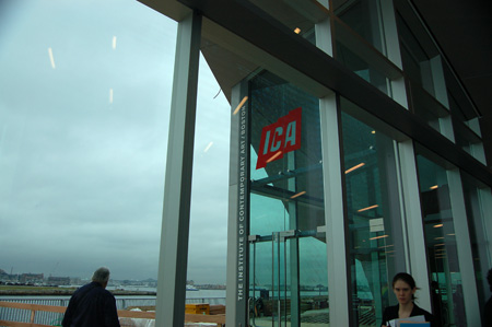
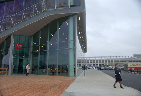
View of main entrance from lobby.
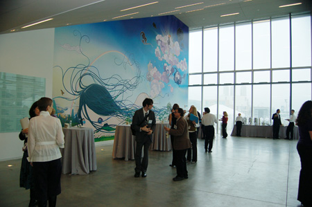
Lobby, including The Divine Gas by Chiho Aoshima on the Sandra and Gerald Fineberg Art Wall.
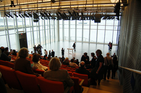
Theater overlooking harbor.
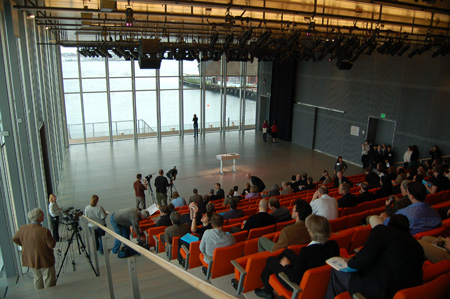
Theater, opposite aisle.
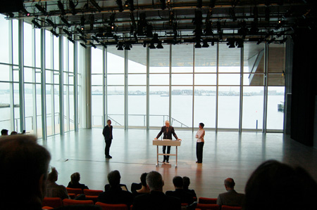
Principals of Diller Scofidio & Renfro.
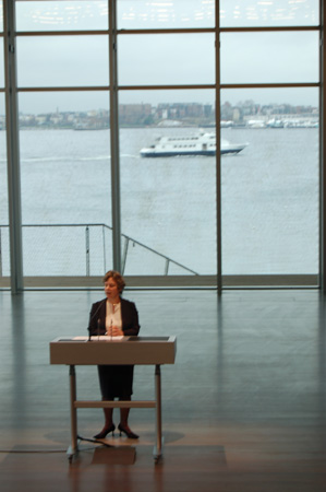
ICA Director Jill Medvedow.
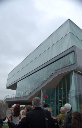
View of building from corner entrance.
Rain picks up and Medvedow invites group back inside.
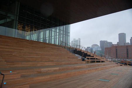
Outdoor steps facing harbor, with space in front for performances.
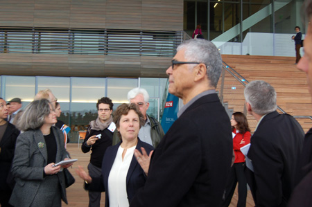
Medvedow and Ricardo Scofidio. At left, in profile, Culture Grrl. Handsome chap over Medvedow's shoulder is Matthew Gamber of Big Red and Shiny. [Update: make that "the gorgeous Culture Grrl." To answer the question, because the word fails to do you justice. Plus, I was joshing Gamber. One doesn't josh Culture Grrl. One respects her.]
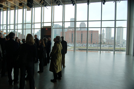
View of downtown Boston from theater.
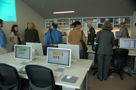
Digital studio, and home of Fast Forward teen program.
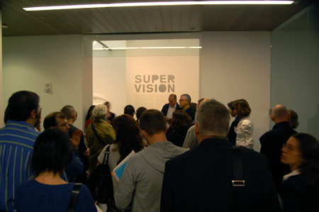
Entrance of "Super Vision" exhibition.
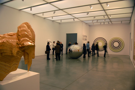
Inside "Super Vision." Tony Cragg in foreground.
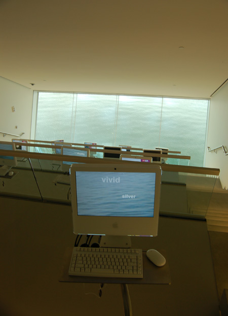
Inside that downward-facing bit under the cantilever, called the Mediatheque.
Update: Since the Roundup got bumped today, I want to mention that Geoff Edgers made his foray into live action this week in a report on the ICA, debuting last night, and to be rebroadcast at various times this weekend, on the New England Cable Network. Or you can watch it here.
2.
December 1, 2006, 5:17 PM
It wasn't as vertiginous as one would think. It sets the water up as a texture in a rather intriguing manner.
3.
December 1, 2006, 5:53 PM
I have to say that I got very nauseous in the Mediatheque and had to leave. Then again, it may have been the smoked salmon.
Franklin, it was great to see you and I'm looking forward to your thoughts on the new ICA. I have to say that, for myself, I'm anticipating the ICA prize announcement with relish.
JL - you were missed. I was hoping that you would be present but Franklin explained the difficulties. Either way, I hope you get it see the new building soon, its beautiful.
M
5.
December 1, 2006, 6:47 PM
Thankfully, very little of the rest of it looks like an IGA.
Much of it is downright amazing.
Jane Marsching was saying that in the galleries, which are lit by sunlight, the daylight-balanced fluorescant bulbs come on as the sunlight fades, so that the galleries have a permanent mid-afternoon glow. It makes some of the work look flat on the walls, and yet creates a timelessness within the space. Actually, she compared it to a mall or casino.
So, back to the original point, it may in fact be a lot like a grocery store or mall. Although I've never seen a mall cantilevered over Boston harbor.
6.
December 1, 2006, 7:55 PM
Ultimately, the only thing that really matters is the quality of the work they show. I like a nicely wrapped present as much as anybody, but that's utterly beside the point if I don't like what's inside.
7.
December 1, 2006, 8:06 PM
I'm going to talk about the work itself next week. I don't want to make too much out of the opening shows, but I'll talk about them all the same.
8.
December 1, 2006, 8:40 PM
Does Medvedow normally stand in a ballet first position? In heels? Isn't that, uh, orthopedically incorrect for laypeople? Looks painful. That 1930s-matron perm job she's sporting is not exactly an aesthetic delight, either. Well, everybody can't be Nina Arias, I suppose.
9.
December 1, 2006, 9:31 PM
I criticise art, not people, but I will say that before I went to grad school I had a job teaching people how to juggle, and learned that anyone who had more than two years of ballet training before the age of eight immediately went into first position as soon as you asked them to do anything. Frankly, it was a little strange.
10.
December 1, 2006, 9:37 PM
The Instant Soup of Contemporary Art doesn't have a wall of Warhols under all those stairs, does it?
11.
December 1, 2006, 9:42 PM
Not a Warhol in the building, as far as I can tell. Not out anyway.
12.
December 2, 2006, 2:46 PM
Well, Franklin, ballet, like opera, is highly abnormal, strictly speaking. That's part of the appeal, knowing "normal" people can't possibly move or sing that way. The castrati, of course, were an even more extreme example of that. The repertoire created specifically for them can no longer be performed as the composers intended because it is physiologically impossible for "natural" voices to operate that way.
Still, if Medvedow is going to assume first position, she should get more sensible shoes. Even real ballet dancers don't wear clunky heels.
13.
December 2, 2006, 4:09 PM
In defense of the Mediatheque: I've experienced my share of sea-sickness, but found the Mediatheque completely un-intruding and amazing. It's certainly the best computer lab I've ever been in, and just might be the best room in Boston, too. It's just as unique an experience as a simple room can be.
14.
December 2, 2006, 5:47 PM
Could have been worse. They could have called the whole thing the Pinakotheke. And the snacks lounge the Paninotheke. But Mediatheque is bad enough. I would have thought a place like Boston would know better, but I suppose no place is immune any more. I also notice the business about naming walls after people. Sheesh.
15.
December 2, 2006, 6:24 PM
I have noticed, that especially of late, wealthy people are 'buying space' to advertise their generosity...a way to be remebered...whether its a hospital wing or an art gallery wall....I suppose its because these places get more traffic then a stone in the grave yard. I think it shows more style and taste to just give anonymously though.
That logo really really needs to be changed..if the person who did it thought it was hip to copy a grocery store, big mistake..just awful.............terrific building though, very nice near the water.
Thanks for the book list...great idea F.
16.
December 2, 2006, 8:07 PM
I have a comment regarding Chiho Aoshima's Divine Fart, but can't find a way to put it delicately enough.
Is the computer lab in that sloping overhang that can just be seen through the window in picture five? The photo of Mediatheque (I kinda like the name) gives me this great idea, which any reader here can have for free: an internet roller coaster - "Surf Splash Mountain!"
17.
December 2, 2006, 10:56 PM
Ahab, look at it this way: at least it's not a wall covered with Warhol cows. Or Maos. Really, MOMA needs to think out of the box a little more. By this point, Warhol wallpaper is like a really tired joke that was never that funny in the first place. What's next, Dali posters?
18.
December 2, 2006, 11:15 PM
As pertains to the Mac lab (theque), I think I'm going to need a diagram of some sort to put those two photographs together. It sure LOOKS like a great space, but if I was looking for a room to put a hundred or so G'z worth of digital imaging equipment into, i'd favor one without a huge picture window, or at least not trust my eyes for colorbalance, lest I end up with some cyanostrosity (like F's first picture).
You guessed right: I'm jealous. It'll be years before we Miamians even know whether H&dM cook up anything remotely this great for us. The auditorium is spectacular (and i'll bet there's a button somewhere that makes blackout curtains come down and have the place pitch-black for video in 15 seconds.
19.
December 2, 2006, 11:33 PM
i'll bet there's a button somewhere that makes blackout curtains come down and have the place pitch-black for video in 15 seconds.
Yep. With an optional transluscent setting with one layer of scrim for light but not the view.
20.
December 3, 2006, 1:17 AM
Yes, Alesh. I too am a little jealous, which is probably why I've been a little snippy about the ICA.
My local art museum is currently preparing for the construction of a new state-of-the-art exhibition facility, as it were. Four months from the first swing of the wrecking ball now, and the project is 20 million over budget, with cutbacks already reducing the practical capabilities of the new building to the bare equivalent of the current decrepit and deteriorating place. It's embarassing, and makes me want badly to leave this cold dry town.
Oh, and by the way, it claims among it's treasures a horrible little Warhol print of Wayne Gretzky.
21.
December 3, 2006, 2:00 AM
Ahab...dont you have an endless supply of oil money out there to waste?
22.
December 3, 2006, 10:05 AM
I'm not even remotely jealous until I see serious evidence that this place is about showing the best work available, as opposed to the same sort of stuff being shown everywhere else because it's what's currently hot, trendy, whatever. The facility as such is just a shell, a glorified container. It the contents are not worthwhile, the container means nothing (except to people who get off on having walls named after themselves).
23.
December 3, 2006, 10:41 AM
Oh, and Ahab, I wish you hadn't mentioned that Gretsky print. The mere thought of it makes me cringe. I expect some people in Edmonton thought that getting it was some sort of coup, which is really rather sad.
24.
December 3, 2006, 12:28 PM
Yes, there is an endless supply of oil money going to waste.
25.
December 3, 2006, 12:31 PM
Jack's got some sort of pre-Art Basel Miami Beach negative jitters, we think, like the opposite of pleasant anticipation. Give us a break! Also give first position ladies a break! Give their shoes a break too. Also take a chill pill.
27.
December 3, 2006, 1:06 PM
Oh Ahab.......Im in pain looking at that.....I need my brain washed now...my eyes actually hurt...........I looked and looked and just couldnt look away.........the horror:(
28.
December 3, 2006, 1:46 PM
Ahab, my sincerest condolences. The thing is unspeakably lame. But just think, it could conceivably be worse, perhaps. It could be a print of some trashy disco creature, like Bianca Jagger or Grace Jones...
29.
December 3, 2006, 1:49 PM
Ahab...just move as far away from 'that' as is possible..come to Toronto:):)
30.
December 3, 2006, 1:51 PM
On second thought, Jagger and Jones were far more up Warhol's alley than Gretsky, meaning he was bound to be more successful (relatively speaking) when dealing with his own kind. Still, dreck is dreck.
31.
December 3, 2006, 2:27 PM
Jack, I make all kinds of typos and misspellings but us Canadians try to get names like "Gretzky" spelled right.
32.
December 3, 2006, 2:57 PM
Sorry, Marc. No sacrilege intended. If he'd been a painter, I would have gotten the spelling right. As you might imagine, most people in Miami are not hardcore hockey fans.
33.
December 3, 2006, 3:16 PM
I'm not realy a hockey fan myself... Actually, I just stole that line from an old comment by Opie, corecting "Gretsky" instead of "Pollack".
Being a smarty-pants is fun!
34.
December 3, 2006, 6:30 PM
Well, thanks for the tribute, Marc. We all make comments that need "corecting".
Yes it is fun being a wise guy.
35.
December 3, 2006, 7:21 PM
off topic but has anyone seen this in the times
http://www.nytimes.com/2006/12/03/arts/design/03kahn.html
is this bad or im getting to loose my taste in art with age
36.
December 3, 2006, 7:39 PM
Marc, you are too funny :):)
Opie, will I ever be forgiven for not getting enough sleep ( I paint through the nights, always have) and speeling pollockes name wrong due to said lack of sleep?...hehe
37.
December 3, 2006, 8:04 PM
You can speel any way you want to, Elizabeth. I am a compusive editor who generates more typos than I correct, so I am in no position to be unforgiving.
38.
December 3, 2006, 8:06 PM
Yes, Samo, it's bad, in more respects that one. Some brief commentary on that tomorrow.
39.
December 3, 2006, 8:11 PM
It is an interesting story, Samo. I read it, too. It is about the cultivation and promotion of an artstar, just like they do it in Hollywood, very careful and businesslike, going for what the public likes. The kid seems perfect for the part, lanky, nice-looking, diffident, quiet, passive. He has the requisite skills and background. It probably will work.
It's sort of like fish farming, or that Japanese beer-fed beef.
40.
December 3, 2006, 9:40 PM
I couldn't make myself do more than look at the pictures on the first page and skim a few lines of the article, but Deitch looks like somebody I'd never buy a used car from, and this Mineo person looks like, well, like he should be represented by Deitch. Whoever falls for this sort of manipulation is fully deserving of it.
41.
December 4, 2006, 4:09 AM
[Ads, even for legitimate-sounding projects, are not welcome here. - F.]
1.
JL
December 1, 2006, 5:09 PM
I've been excited about everything regarding this building except the horribly named "Mediatheque." I'll grant it's a daring idea, for what that's worth, but I can't help but feel that spending any serious amount of time in that space would be nausea-inducing. Maybe I'm wrong--I haven't been in it, after all--or maybe others have stronger stomachs, but it doesn't strike me as a feature that's going to age well.
Great views, otherwise, though. And if you're willing to go through a metal detector, you can get a decent and relatively cheap lunch with the same view on the harbor in the cafeteria at the courthouse nearby.