Next: Circa six hours ago at the ICA (41)
Welliver prints
Post #915 • November 30, 2006, 11:19 AM • 6 Comments
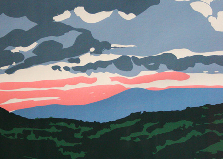
Cambridge, MA — Nestled atop MIT's Sloan School of Management lies an exhibition space. A former office worker's longtime effort to keep the handsome academic offices overlooking the Charles plied with art became a regular program of the List, and thus the Dean's Gallery came into being. Through January 15, 2007, it's showing "Neil Welliver: Prints from the Maine Landscape," a handsome series of color silkscreens dating from the early 1970s. The forced restraints of printmaking suited his style, cutting down on the excessive busy-ness that sometimes looks bothersome in his paintings. He could pare down when he wanted to: the prints show great canniness in their simplicity, creating atmospheric effects and lush dimensionality in a medium given to neither. The best of the bunch depicts elms in a dense forest, their white trunks launching blank paper into the foreground, although a few others, including the one below, were equally delightful.

Neil Welliver, Landscape (detail), 1973, serigraph, Gift of the Albert and Vera List Collection
2.
November 30, 2006, 4:09 PM
I like it. I wish it was in my home.
3.
December 1, 2006, 9:39 AM
Interesting for the way the illusion of deep space is or isn't created in the print. The most intense colors are at the horizon.
4.
December 1, 2006, 8:59 PM
Thanks Neil,
this looks sublime...
not literal.
5.
December 2, 2006, 6:46 PM
Franklin - I studied with Welliver at Penn in the 1990's. He had amazing facility as an artist, and an uncompromising approach to the process of how to move paint and fill a surface with an image.The prints and the small study paintings (often done plein-aire in the Allagash to be later worked up to large scale in his barn for consumption at Marlborough Gallery) retain a playfulness and searching, musical (i.e. improvisational )quality for me. He could be overbearing/dogmatic as a teacher, at least to this stubborn student, but some of his edicts are actually just now resurfacing in my work, 15 or more years later. BTW, I think the best of your new ptgs. have an affinity with the Welliver/Katz approach, and the surfaces, markmaking and attention to edges make them more than just interesting excercises in color composition. There was an emotional impact to some of the figuration that surprised me, given its coolness and simplicity. So that is a kinship you have with Welliver.
6.
December 3, 2006, 12:29 AM
Stumpie, I appreciate the remarks.
1.
Jack
November 30, 2006, 1:44 PM
Nice. Rather less prissy, anemic and plastic than the recently posted Alex Katz.