Previous: Providence Poster Art (6)
Beyond Basketry at the MFA
Post #894 • October 25, 2006, 11:13 AM • 31 Comments
Boston — I can only imagine, and probably not with any accuracy, the kind of hand skills that go into Japanese basketry. As Beyond Basketry: Japanese Bamboo Art at the MFA demonstrates, masters can coax bamboo into shapes that strain credulity - wild forms that recall complex topology models, creating surface patterns that seem like they would be difficult to draw, much less sculpt. One would expect modern craftsmen with skills like these to want to innovate, and while there are more than a few objects that evince art envy, most riff on traditional models, both within and outside basket-weaving, with spry authority.
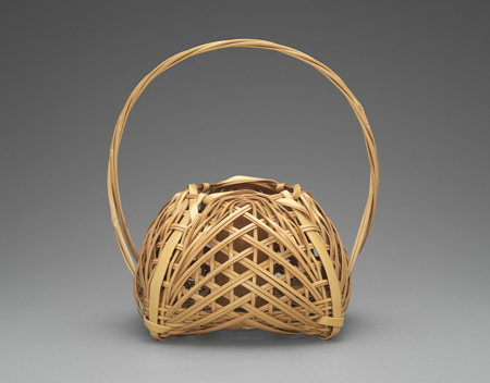
Shono Shounsai (Japanese, 1904-1974): Basket, 1955-1965, madake bamboo (Phyllostachys bambusoides) and rattan; woven in yotsume (square plaiting) and gozame (matting) styles. Museum of Fine Arts, Boston. Museum purchase with funds by exchange from the William Sturgis Bigelow Collection. Photograph © Museum of Fine Arts, Boston.
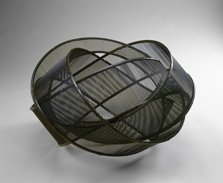
Uematsu Chikuyu (Japanese, born in 1947): Kaze (Wind), 2004, madake bamboo, kurochiku bamboo, lacquer, and washi paper. Collection of Saitû Masamitsu. Courtesy, Museum of Fine Arts, Boston.
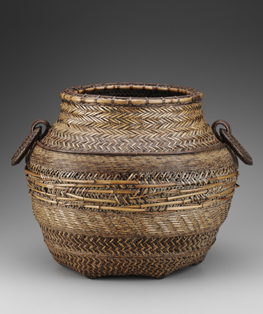
Iizuka Hosai II (Japanese, 1872-1934): "Ancient Vessel Shape" (Jidai Kamegata) Basket, Taisho era, about 1925, inner layer: dyed madake bamboo strips; outer layer: the ajiro-ami weave of thin bamboo (probably top end of Hoteidake bamboo), using both peeled and unpeeled; branches of the same kind of thin bamboo is used for the decoration in the middle of the body; rim: rattan and bamboo; rings: rattan; finished with dust and lacquer. Museum of Fine Arts, Boston. Keith McLeod Fund. Photograph © Museum of Fine Arts, Boston.
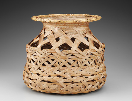
Iizuka Rokansai (Japanese, 1890-1958): "Longevity" (Kotobuki) Basket, Showa era, 1935-1945, body: madake bamboo; rim: bundled bamboo branches wrapped with negamaridake bamboo; finished with dust and lacquer. Museum of Fine Arts, Boston. Keith McLeod Fund, Photograph © Museum of Fine Arts, Boston.
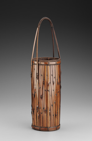
Iizuka Rokansai (Japanese, 1890-1958): "Bamboo Grove" (Chikurin) Basket, Showa era, c. 1945, inner layer: dyed madake bamboo; outer layer: susudake smoked bamboo, finished with dust and lacquer. Museum of Fine Arts, Boston. Keith McLeod Fund. Photograph © Museum of Fine Arts, Boston.
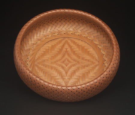
Shono Shounsai (Japanese, 1904-1974): "Peerless" basket, 1953, madake bamboo (Phyllostachys bambusoides); woven in rinkû (scale-armor) and ajiro (twill) styles. Museum of Fine Arts, Boston. Museum purchase with funds by exchange from the William Sturgis Bigelow Collection. Photograph © Museum of Fine Arts, Boston.
2.
October 25, 2006, 11:34 PM
I can only image
the esthetic beauty of these works would be truly profound
when seeing them in person.
Just beautiful!
I agree ahab
"these baskets couldn't possibly be better in any other material"
3.
October 26, 2006, 9:09 AM
The top and bottom of my list is the same as yours, Ahab (6, 5, 1, 3. 4, 2) and the rest not that different. #6 is very "baskety" and the weave develops nicely as it proceeds out from the center and up the sides. #2 looks as if it derives from a Chihuly "nest" idea - trying too hard to be "art" - and seems flimsy rather than delicate.
I have a dozen or so baskets from very different sources and think they are very underappreciated, except for Indian baskets and Nantucket lightship baskets, examples of which can go for many $$thousands.
4.
October 26, 2006, 10:03 AM
These are quite beautiful. Having seen more and more of your posts since i found this site, I find it refreshing that you cover all areas of art. (Most in which tend to be tucked away in obscurity)
Keep up the good work!
5.
October 26, 2006, 12:28 PM
My favorites are 1 and 5. Number 6 is more impressive for technique but is relatively faceless otherwise. 1 and 5 have more character; 6 is more like a very fine luxury item. Number 2 is clearly the worst, prissy and fussy to no great effect, like it's trying too hard to be "moderne."
6.
October 26, 2006, 1:32 PM
I wouldn't argue with you about #5; it does have more overall character than #6. #1 seems a little prissy to me
7.
October 26, 2006, 4:58 PM
I'll take #3 over #6.
8.
October 26, 2006, 6:18 PM
"Relatively faceless", Jack - like Franklin's recent paintings?
9.
October 26, 2006, 6:45 PM
You just like those big heavy-looking things, Marc.
You'd even paint it blue, I bet.
10.
October 26, 2006, 7:10 PM
Noone's asking me to write a defense for #6, the Peerless Basket, but wth.
I'm especially intrigued by its top edge: a continuation of the weave that rolls over from the outside surface creates the inside wall surface. The complex-curve of the roll is just right and looks it. Though perfect spacing may not be a given virtue for craft- or art-works, in this case the regularity of the weave goes hand in hand with both outer and inner forms and I think it works especially well. That it has been made using a scale-armour style of weaving is somehow informative about the final effect of the thing. Yes, #3 is good for some reasons to the converse, but I still like #6 better.
I just noticed the dates, and am not in the least surprised to see that #2 is so recent. So much contemporary sculpture suffers the same suckiness the world over.
11.
October 26, 2006, 8:09 PM
I'd like to handle that basket (#6) and see how they tucked in the bamboo strips that rolled over, and how the bottom was attached - whether perhaps the strips were completely continuous. it really is damned ingenious.
12.
October 26, 2006, 10:34 PM
I meant relatively faceless compared to the other baskets I mentioned. Number 6 is a superb piece of craftsmanship, but it looks so luxurious and upscale that, in a sense, it's at odds with its basketness.
13.
October 26, 2006, 10:35 PM
Number 2, by the way, looks worse every time I glance at it.
14.
October 26, 2006, 11:04 PM
I think my favorite is #4 the weave of the bamboo is beautiful
it's even finished with dust.
Undecided about #2 I am not sure I would call it a basket or a piece of Disco Jewelry
#6 is elegant and complex but boring for me
My second favorite is #3 love the texture, love the color. How organic
15.
October 26, 2006, 11:55 PM
Sorry Jack. I still don't understand the "faceless" part. They're also "legless", and not relatively so.
16.
October 27, 2006, 2:54 AM
Phenominal craft-person-ship in all pieces.
17.
October 27, 2006, 3:00 AM
Darby's essay is phenomenal as well!
18.
October 27, 2006, 10:56 AM
Ahab, I wasn't using "faceless" literally. I meant relatively lacking in a distinctive, individual personality or character, or, if you prefer, relatively bland.
19.
October 27, 2006, 11:18 AM
Jesus H. Christ, I hate essays which begin with a question, let alone six of them! It's almost as bad as essays which start with "Webster's defines . . . "
20.
October 27, 2006, 12:34 PM
What essay are y'all talkin' 'bout?
21.
October 27, 2006, 7:00 PM
Franklins link above.
Darby seems to be indicating that he believes material specificity is an indicator of esthetic quality, or put another way an object worthy of appreciation is true to the essentials of its own craft.
22.
October 27, 2006, 7:15 PM
"an object worthy of appreciation is true to the essentials of its own craft"
I think the essay (lecture) indicates that for glass experience says that this is usually the case, but there is no rule stated to that effect.
23.
October 27, 2006, 9:16 PM
19: lectures necessarily read quite differently from essays, for one; and two, this lecture starts with six "uncertain anxieties" (sic) regarding arts&crafts that seem important to the topic, but which are summarily dismissed in sentence seven forward for their redness and their herringness.
24.
October 28, 2006, 12:16 AM
Thanks, J. For some reason, I had to look, look, and relook again before I could see the second link.
25.
October 28, 2006, 7:44 PM
From the essay:
"Class is very aloof".
Indeed.
26.
October 29, 2006, 12:21 AM
What sharp eyes you have, Grandma...
How much do you charge for proofreading?
27.
October 29, 2006, 12:24 AM
Well, (nobody should start off this way when writing) when one reads something this profound, one can't help but project their own subjective interpretation into/onto the reading experience and thus may come up with conclusions contrary to the writers intensions.
Questions:
Should glass 'show-off' its inherent glass-ness ?
Is a bronze sculpure about it's finale appearance or it's origional conception by the artist/maker (in clay or plaster or foam etc.?)
Does it mater what kind of fiber that these baskets ( for a lack of a correct austere word ) are constructed from? Or like Skrimshaw, does it matter who made them ?
I can't help but think that the intensions of Darby's essay (metaphorically) are material specific oriented; as if to say that when the materials used are as close as possible to the thing made, the object exists in it's best and proper state of being and is thus 'better.'
28.
October 29, 2006, 1:00 AM
J - there is a crucial difference between tentative (and arguable) speculation drawn from observation of specfic fact and tendering an applicable rule for all possible cases. As it is stated in the text: "These are not provable assertions, of course. They are conclusions drawn from long experience with craft and art".
The minute you make a rule in art it will be broken. But looking hard and commenting on what can be drawn from that looking is interesting and can be valuable.
29.
November 7, 2006, 7:47 PM
I was very interested to read various people's order of preference of the baskets shown. My order is 4, 5, 2, 3, 1, 6. This order comes from having seen most of the pieces in person and having seen similar/identical pieces in other collections.
While #4 is not the best example of Rokansai tabane-ami ("layered weave" which fans out) baskets extant, it is certainly way up there; and the diificulty of construction of this particular basket (the tabane-ami baskets which could be said to be "better" would be called such becauseof simplicity of form ("Anko") or because of gorgeousness of detail ("Hoden", or "Fuki"). The creativity and technique involved in the tabane-ami form is at the highest levels of the art.
Chikurin (#5) is simply gorgeous. Technically speaking, it is less difficult, though the choice of bamboo type, and selection of the bamboo itself along with the kind of "armored" construction are pure Rokansai.
"Wind" is big. Very big. And the contruction is so fine and detailed that if you haven't seen it up close and in person (and have very good eyesight when you do), some of the greatness of this basket is lost.
#3 is classic Hosai, with many elements showing where Rokansai got his original training (Hosai was Rokansai's much older brother and original teacher). A great Hosai piece.
It pains me to put a Shono Shounsai basket at 5th or 6th in a list of 6 baskets, but there are better ones out there. #1 and #6 are not ground-breaking in their form, use of the material, or design references. #1 is a reference to a several-hundred year-old design, and while if I wouldn't mind having it in my collection, I'd rather have the others. And #6 is an extremely good version of a basket one can find elsewhere. My personal ranking of these two is such because he has so many other works which made him utterly deserving of receiving the LIving National Treasure appellation.
If anyone has not seen the exhibit, and is interested, I strongly recommend a visit. Japanese bamboo basket exhibitions of this caliber don't happen often.
30.
November 7, 2006, 9:11 PM
You're always welcome here, Tbone.
31.
November 8, 2006, 10:35 AM
Thanks Franklin.
A few further comments on #6...
#6 is actually a relatively easy weave but because it has the double-walled body, but the elegance tends to hide the technique. If one ignores the flat-woven bottom, it becomes easier to visualize. The ring around the inside is the middle of a set of strips. If you look closely, you can see that just outside that ring, the strips cross. Between where those strips start to climb the wall, there is another one coming down from the rim which seems to disappear. That strip comes from the "underside" where there is an identical ring. The strips from the underside ring fill the spaces betweeen the strips from the front ring and the ends are hidden under the "crosses" of the pieces coming off the front ring. The front strips end on the back, tucked into the same kind of cross created on the underside ring. The middle design is made by putting proggressively narrower (or wider) strips next to each other, and doing the same for the cross strips, so that the flat spaces reflect light differently and a pattern shows.
For those with commentary on Uematsu-san's "Wind"... Shono Shounsai and Maeda Chikubosai did similar pieces in the early 1950s (and this is obviously a reference to those pieces in some way shape or form (Uematsu-san's other pieces are far different)), but the level of skill involved in the making of Uematsu Chikuyu's piece is shocking. Think about this as a single strip of paper something like 10 feet (3 meters) long, which circles around itself like a whirlwind. Then construct that intertwining strip using a thousand thin bamboo pieces built into sideframes. Now show me how the cross strips are connected to the sideframes so the whole thing doesn't fall to pieces. If you look very closely, it's easy to understand, but then you wonder how he actually managed to do what you see using only bamboo.
1.
ahab
October 25, 2006, 7:17 PM
Very very impressive objects (except I don't much like 2: Wind). Basketry, as shown here, seems to borrow a lot from pottery forms - even the finishes remind me of fired glazes. But these baskets couldn't possibly be better in any other material. In order of goodness 6, 3, 5, 4, 1 (as best as I can discern over this charg-ed filament).
I'm used to joking around about taking Basket-Weaving 101 to pad the GPA. Were any of these baskets woven upside-down underwater? 'Cause that would be really really hard.