Previous: I give up roundup (22)
PSiNE - Women and flowers
Post #851 • August 14, 2006, 6:02 PM • 10 Comments
It seemed to come up a lot.
Ed was able to join JL and I, and the result was probably a bit more criticism than was called for, but no matter. The art lovers were out. The surface of this Benson came under discussion. I'm for it - a clotted, stucco-like skin that makes the atmosphere buzz with daylight.
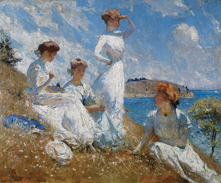
Frank Weston Benson: Summer, 1909. Oil on canvas, 36 1/8 x 44 1/2 inches. Museum of Art, Rhode Island School of Design, Providence. Gift of Isaac C. Bates. Photograph by Eric Gould.
This Blume was all coolness and precision by comparison. I know little about Blume, but a bit of web searching indicates that he was a Russian-Born American garden-variety surrealist. This looks like one of his better works.
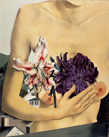
Peter Blume: Flower and Torso (Torso and Tiger Lily, 1927. Oil on canvas, 20 x 17 inches. Collection of Barney A. Ebsworth.
What fun. This is almost garish, but pay no mind. The bigger problem here is the surfeit of Impressionist works in this ilk. That's not the painting's fault, though. Pretend you've never seen this big white dress - handsome cultivar combination before.
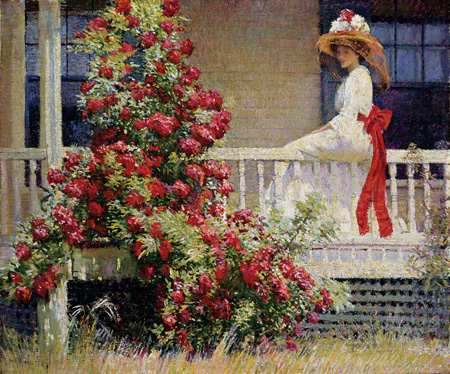
Philip Leslie Hale: The Crimson Rambler, 1908. Oil on canvas, 25 1/4 30 3/16 inches. Courtesy of the Pennsylvania Academy of the Fine Arts, Philadelphia. Joseph E. Temple Fund.
Really.
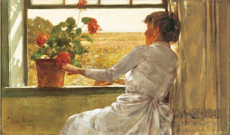
Childe Hassam: Summer Evening, 1886. Oil on canvas, 12 1/8 x 20 3/8 inches. Florences Griswold Museum, Old Lyme, Connecticut. Gift of the Hartford Steam Boiler Inspection and Insurance Company.
I mean it. Actually, this one's a ringer. The Impressionist fireworks are there, but at the same time the figure has an air of Scandinavian introversion. Tarbell, I think, could use a reassessment.
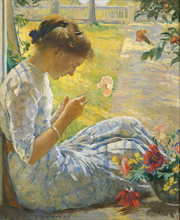
Edmund C. Tarbell: Mercie Cutting Flowers, 1912. Oil on canvas, 33 x 27 inches. Currier Museum of Art, Manchester, New Hampshire. Partial gift of Henry and Clara Mixter and purchase with funds provided by Henry Melville Fuller and many friends of the Currier.
2.
August 14, 2006, 8:14 PM
The Benson does sparkle in the sun, but the problem is that it immeduately recalls the two well-known Monets of 1875, the Lady with Parasol and the Lady with Parasol and Child (as I remember the names, anyway), supreme examples of raking sun on a windy day. The one with the kid has really ferocious white clouds that dazzle me every time I look at it. Benson has a hard time with shading off of the extreme highlights and it makes them loook a little solid, like white wrappers. It is not an easy thing to do.
Peter Blume I met as a kid. He lived across from a friend of mine in Sherman Connecticut (my friend now lives in his house), and seemed a formidable person, though that might have been because I was young. He was quite prominent in the 40s when this kind of Surrealism had its heyday in this country. Gorky also lived right there, and my friend and his father cut him down, or were there when he was cut down, after he hanged himself in 1948.
3.
August 14, 2006, 9:45 PM
Wow! Way to suck the new England sunshine out of the air, opie! Nice morbid ending!
Jack, what you wrote about the Tarbell makes me want to express a feeling I wasn't quite sure about. Something about the scale of the brushstrokes in the rendering, maybe, or the way the girl interacts with the background, or the viewpoint, or just how she's framed by the borders... something is giving me the impression that this girl is some kind of giantess, but I can't quite put my finger on exactly why... anybody else get this?
4.
August 14, 2006, 9:47 PM
... maybe it's just her unflattering elbow-length sleeves... ladies, are you with me?
5.
August 14, 2006, 9:53 PM
The composition is reminding me of another seeming giantess, reversed...
6.
August 14, 2006, 11:37 PM
Once you start looking, Marc, her left thigh looks like it is about 4 feel long.
7.
August 15, 2006, 12:09 AM
Marc....shes missing boobs.........no balance ....teenage body...all arms and legs
8.
August 15, 2006, 1:15 PM
thanks Edmund.
9.
August 16, 2006, 9:37 PM
This is the most retrograde shit on the planet. Could these paintings be any more pedestrian and shallow? Um, forget about post modernism, you guys should try and give modernism a try. Middlebrow crap.
10.
August 17, 2006, 12:02 AM
Yeah, Franklin. Put on some deep paintings for Mr. Kidding. There are those of us who need true profundity. Something with angst, meaning, relevance and truth. Not just pretty pictures.
1.
Jack
August 14, 2006, 7:45 PM
The Benson makes me think of Tiepolo (that blue always does), which is a very good thing. The Blume I have little use for, though it's interesting, in a lab-specimen sort of way. The Hale is too pretty and overdone; it would have been significantly better without that huge, gratuitous and rather vulgar red bow. The Hassam looks like Wyeth, only smoother or less prickly--more French. The Tarbell is a little awkward in a lovely way, like teenage girls can be. I would have toned down or reduced the flowers in the lower right corner; they're a bit garish and compete with the girl more than they should.