Previous: Ukiyo-e at the Boca Museum (13)
The Art of the Poster at the Boca Museum
Post #774 • April 13, 2006, 11:43 AM • 4 Comments
"Now this is graphic design," I said to Supergirl as we entered The Art of the Poster: Toulouse-Lautrec and His Contemporaries at the Boca Museum. Late 19th and early 20th Century posters are as raucous and engaging as good jazz. Talents like Toulouse-Lautrec and Bonnard applied themsleves to the medium, using a barely-controlled line and evocative understatement. Others went the way of Alphonse Mucha, capitalizing on the sensual, machined curvilinearity of Art Nouveau. Thinning out the salon-style installation to about half would have left the jewels and eliminated the clunkers, and those jewels would have served adequately to convey a useful observation about the contemporary man-made world: it could use brighter colors and more spirals.
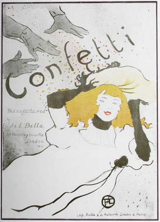
Henri de Toulouse-Lautrec, Confetti, 1893, lithograph in three colors, 29 x 22 inches
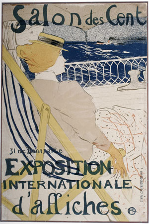
Henri de Toulouse-Lautrec, La Passagère du 54 - Promenade en Yacht, 1895, lithograph, 23.9 x 15.9 inches
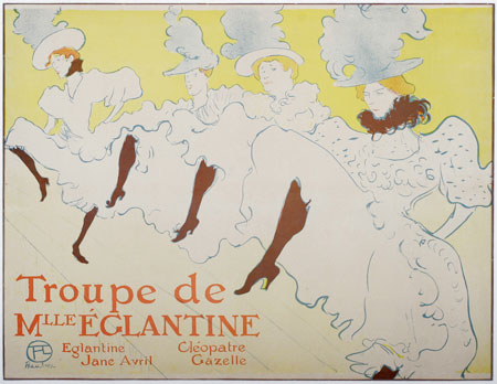
Henri de Toulouse-Lautrec, Troupe de Mademoiselle Eglantine, 1896, lithographic poster, 24 5/16 x 31 5/8 inches
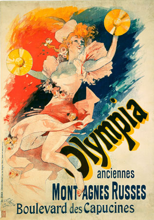
Jules Cheret, Olympia/Anciennes Montagnes Russes, 1892, color lithograph, courtesy of The Rennert Collection, New York City
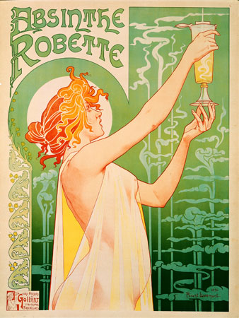
Privat Livemont, Absinthe Robette, 1896, color lithograph, from the collection of Todd Canterbury, Washington, D.C.
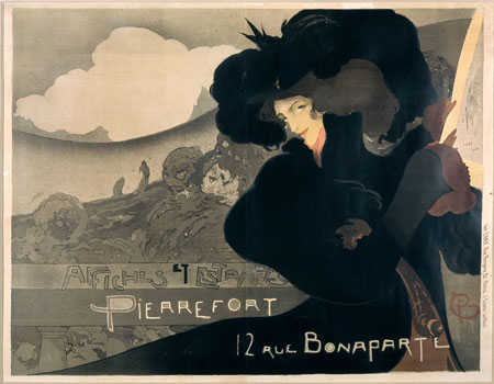
Georges de Feure, Affiches et Estampes Pierrefort, 1898
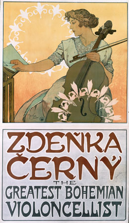
Alphonse Mucha, Zdenka Cerny, 1913
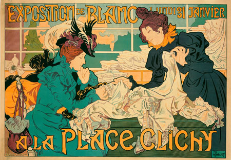
Henri Thiriet, Exposition de Blanc a la Place Clichy, 1898
2.
April 13, 2006, 1:11 PM
...using a barely-controlled line and evocative understatement...
You said that super, and to the point !
3.
April 13, 2006, 3:59 PM
Makes one want to sip absinthe with Jane Avril, and listen to Zdenka play Schubert.
Yes, the line is supple and casual, and "off-hand", so to speak, as in the hands in the confetti poster. The color is excellent too.
Good stuff.
Marc, there was a time years ago when everyone had a bullfight poster on the wall. The influence of Hemingway and all that. Now I think they are quite valuable, along with everything else.
4.
April 13, 2006, 10:54 PM
I read "Death in the Afternoon" before I spent a couple of months in Spain, but it was over the winter, so I never got to see a bullfight... the book had me very intrigued though, wanting to check out this 'art form' for myself... I imagine it's a little like a rodeo-style opera, but instead of singing, ritual animal slaughter.
I did pick up a cheap T-shirt as a souvenir, with a reproduction of a poster featuring "El Cordobes". The shirt might have lasted longer had I hung it on the wall instead of wearing it...
1.
Marc Country
April 13, 2006, 11:58 AM
Something about the Charet "Olympia" has a 1970's-80's feel (some kinda Carnival Cruise ad)... somehow, it also reminds me of some nice vintage bullfight posters I've seen in Spain, maybe becuase of the expanded palette (compared to the others here).