Previous: The fizzling future of arts journalism (56)
Next: Bloody Do-Gooder Roundup (38)
John Sanchez: Recorded Eyesight
Post #1402 • October 9, 2009, 7:22 AM • 150 Comments
The essay below was commissioned by Dorsch Gallery for the the exhibition John Sanchez: Recorded Eyesight, which opens tomorrow along with exhibitions of Jenny Brillhart and Richard Haden.
How good is painting? Not individual painters, but the art of painting itself? Is it so good that we can take the techniques of figurative painting as it was practiced in the late 18th and early 19th Centuries and apply it successfully to our own circumstances? John Sanchez set out several years ago to answer this question, and his labors are culminating in a provable affirmative. Our circumstances, it needs to be said, do not permit a rehashing of artistic standards lifted wholesale from the year 1820. We're modern people with cameras and electric lights, and realist art that doesn't account for them, both as subjects and as influences on the history of image-making, doesn't fully pertain to us. Sanchez has identified a way of working at once painterly and photographic, employing the richness of glazed oils and the quirks of the camera. Lights blast into undifferentiated white masses, and shadows turn into black walls. Normally we would scold an artist for painting things in the way they turn out in a photo. But Sanchez has built a new sort of creature, combining the studied authority of photorealism and the drama of the Barbizon school. The paintings make one think alternately of Daubigny and Robert Bechtle.
Too, if painting is good, then the light that glints on the rain-washed asphalt of Biscayne Boulevard is as worthy of depiction as any light that fell on Inness's bucolic New Jersey. The thunderheads that menace Miami's landscape of overpasses and palms are not inferior to the ones that troubled the ships in Turner's seascapes. Not only is the red pickup truck lovely in the stadium lighting, but the artificial way that the camera records it in the surrounding darkness of the parking lot is beautiful as well. Indeed, these possibilities bear out. In Sanchez's work, sunshine of divine intensity obliterates the glass facade of a rest stop on the Florida Turnpike, as Americans, identifiable in their sneakered corpulence, pleasantly and heedlessly mill about in it. There is no irony here. The subject's banality and its beauty transform into a single phenomenon when seen in the right way.
The great novelist Jean Giono once wrote, "The present disgusts me, even to describe." I thought of Giono when I saw these paintings, which I studied in the presence of the artist as he prepared to have them set into frames that harkened to a previous century. (It was a smart choice, echoing the artist's dual pursuit - perfect contemporaniety, and consummate execution as measured by the tradition of oil painting.) If only Giono had seen what Sanchez sees in the present. He might have appreciated what the painter has found: a persistent attractiveness that belongs equally to every time.
- Franklin Einspruch, Boston, 2009
2.
October 9, 2009, 8:03 AM
Nice essay Franklin. It's a very important point - painting in a contemporaneous world, in the world as we find it - and you've asked the right questions. They are questions I ask myself when I drive up the hill from my shop and see a row of American flags(seeing Prendergast or Childe Hassam) in front of the "brutalist" Paul Rudolph-esque Fall River City Hall, under an Inness sky. Beautiful light in his paintings.
3.
October 9, 2009, 8:05 AM
TG Photography is still a problem for painters who just get their information from photographs. Does Sanchez paint from nature Franklin? It looks like he does.
4.
October 9, 2009, 8:28 AM
I was confused, reading this piece, at first, thinking, Shouldn't this be on the Kung Fu page, not artblog.net? Then, I thought, does "Centuries" need to be capitalized? But, then I thought maybe referring to particular centuries by name made them proper nouns... I'm no writer, so I couldn't say for sure.
A nice essay, Franklin... even nicer that you didn't bring John Cage into it. I like those Sanchez paintings, too. I do not like those Lowery ones, though. Yuck.
We've got a realist painter on at Common Sense, opening tomorrow, but the poor bastard has to drive 6 hrs up from Medicine Hat on shitty, snowy, icy roads this morning to hang them this afternoon. Alberta received its Christmas whitening early, you see.
Wish y'all were here!
5.
October 9, 2009, 9:32 AM
MC, I left the house yesterday still wearing shorts.
I was going to say, Franklin, that this is the first time I've heard New Jersey referred to a bucolic, but clearly, compared to Alberta, it is.
6.
October 9, 2009, 9:53 AM
So Chris, does that mean you normally don't wear underpants?
8.
October 9, 2009, 10:18 AM
Well, for what it's worth, I'm planning to put in a now rare appearance at Wynwood for this show, which I had previously heard about. Not sure about those frames, though, but we'll see. I happen to be extremely particular about framing myself. Actually, I'm extremely particular in general, but never mind.
9.
October 9, 2009, 10:40 AM
'MC, I left the house yesterday still wearing shorts."
So did my mailman.
Ok, the roads aren't probably so bad as I made it seem, but still, with snow this early, I'll take New Jersey.
It's the Garden State, after all.
10.
October 9, 2009, 10:58 AM
Is John Sanchez' dazzling handling of paint an effort to keep me from noticing an overreliance on rather unimpressive photographic imagery in place of honest drawing which can enrich a work immeasurably by revealing a distinct sensibility?
I need for art to take me out of time. Sanchez' recent paintings, like snapshots, seem rather to mark time. His painting skills are admirable and even enviable, but I don't think it's possible to heighten a moment, to lift a moment out of itself, by steeping that moment in dazzlement.
I've seen some of Sanchez' earlier work, which seems more adventurous, more exploratory. In that work there seems to be a kind of searching for or teasing of or blurring of a line between photo imagery and 'abstraction'. That painting looks like it could've led somewhere. But Sanchez seems to have backed away from that toward something which is perhaps more marketable, but which places his work in the stylistic territory of any number of illustrators.
I wish Mr Sanchez the best; he obviously has real capabilities. He only needs to bring himself back into the picture and apply those capabilities rather than indulge them.
11.
October 9, 2009, 11:00 AM
Parts of Montclair actually do still look like that.
12.
October 9, 2009, 11:30 AM
Damn it MC. You always get my hopes up when I click your links over to common sense. Please ensure the next time I go I never see that
Dean Smale painting again. In fact, buy the painting from the poor fellow and ship it to these guys: http://www.youtube.com/watch?v=ExSKW1bwBq8&feature=related
I'm praying one day I'll see the episode. "Is it a good idea to microwave a Dean Smale painting".
If you are not up to your duty as a fellow artist send me an email detailing the price and shipping arangements and I might do it myself. send the email to:
kamikaze_ben@maketimeforaclearmind.com
Thanks!
13.
October 9, 2009, 12:07 PM
New Jersey is still bucolic. Most people only know it from driving down the turnpike. That's like characterizing a person's appearance by traveling through her digestive system.
14.
October 9, 2009, 12:10 PM
"I happen to be extremely particular about framing myself."
You don't say.
15.
October 9, 2009, 12:27 PM
That Guy: Be careful, that Dean Smale picture looks expensive. Something about it makes me think the artist proceeded by "characterizing a person's appearance by traveling through her digestive system", to borrow from opie completely out of context. That kind of insight, meticulously rendered, commands big bucks.
16.
October 9, 2009, 12:28 PM
My son -- 12 years old -- totally loves the "Is It a Good Idea to Microwave This?" videos. He desperately tried to get me to watch "Is It a Good Idea to Microwave an Airbag?" (Answer: No, not at all.) He and a friend started some test footage for their own series, "Let's Throw This Out the Window!" They threw his stick of Old Spice deodorant -- given out free in hygiene class last year and now the kids smells like my dad on "We're visiting Grandma" day -- out the window. Know what happens when you throw a stick of deodorant out the window? Nothing.
17.
October 9, 2009, 12:29 PM
Apologies, I guess, TG. Keep clicking! And, keep in mind the jpeg is a detail of a larger work.
The imagery is a little off-putting, I agree. Also, I admit, I haven't seen the actual paintings in the flesh myself, so I'm reserving my final judgment (likely not involving a microwave oven) for when I see the real things in front of me.
Which should be within the hour... come on, 'that guy', tell me you're not a little jealous.
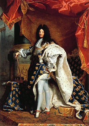
18.
October 9, 2009, 12:30 PM
Ya sure, That Guy, it'd be good to know if a Smale painting could be microwaved, but what I really wanna know is, will it blend?
19.
October 9, 2009, 12:32 PM
"Something about it makes me think the artist proceeded by "characterizing a person's appearance by traveling through her digestive system", to borrow from opie completely out of context."
Hey! You read his artist statement! That's cheating!
The show is called "Inner Sense", after all...
20.
October 9, 2009, 12:33 PM
Yup, just checked. I forgot my meds today. We now return you to your regularly scheduled yen like artblog. I hear you John I may pay double if it's off the website by 6p.m. eastern.
21.
October 9, 2009, 12:35 PM
New Jersey may appear bucolic if you get off the Turnpike -- although if you really want digestive system, I recommend Route 1&9 -- but let me tell you, a lot of that bucolic beauty is contaminated eight ways from Sunday. It was probably being actively poisoned while Inness was painting it, actually.
22.
October 9, 2009, 12:36 PM
Actually, Ahab, I love taking something to be framed. If it wasn't so expensive, I'd be framing something every week. I especially love framing work on paper, like prints. Then it's not just the frame, but the matting, the precise shade, the width, trying and rejecting one possibility after another, making the framer fetch and carry and scavenge through the stock of samples...the problem, of course, is that I'm really Louis XIV trapped in an average person's life, but we all have our issues.
23.
October 9, 2009, 12:42 PM
I missed Jack's underpants remark, and he missed Ahab's jab. It all evens out eventually.
24.
October 9, 2009, 12:43 PM
I am a little jealous. It is not every day one gets to meet the man behind the picture. Especially that kind of picture. You lucky devil.
25.
October 9, 2009, 12:49 PM
Well, lucky for Mr. Smale, he is one charming mutha fuckin pig (ten times more charming than that Arnold on Green Acres).
Maybe you prefer Dean's earlier work... maybe not, though.
I'm looking forward to seeing his new stuff. Sorry you won't be able to, TG.
26.
October 9, 2009, 12:49 PM
Correction, Chris, I chose to ignore Ahab's jab. But you wouldn't understand. It's a French thing. You're some vulgarian with dubious undergarment practices.
27.
October 9, 2009, 12:50 PM
I think Mr. Smale's detail there looks pretty good. I'd like to see the whole thing in real life.
28.
October 9, 2009, 12:52 PM
What you have failed to perfect, Jack, is the French way of making it clear that the remark was heard and understood while you ignore it. This time out it just looked like it went over your head.
As far as my underpants go, my underpants go far.
29.
October 9, 2009, 12:55 PM
When he does arrive I'm not sure you should tell him right away that his work has sparked some interest from a collector in Miami who happens to be very keen on watching his paintings suffer irreparable damage.
30.
October 9, 2009, 12:55 PM
Every time Jack and I start trading quips, though, I can almost feel Franklin's hackles rising. "Get back to my post! You're draining my credibility, you bastards!" I hear him thinking.
So, getting back to Franklin's post: I didn't think it the first time I read through it, but re-reading it I realize you start out asking a great question. How good is painting? That is so fantastic a leap to make, to highlight and encapsulate so much of probably forty years of art world argument. Asking that sums up so much for me, and to answer it -- painting is really, really good -- finally feels good.
31.
October 9, 2009, 12:58 PM
Chris, Ahab is from Canada. And not even Montreal, but Alberta. As for your underpants going far, they'd better. Lots of ground to cover, I shouldn't wonder.
32.
October 9, 2009, 12:58 PM
I'll start with "Sparked interest..." and let the rest trickle out from there.
Spark" is enough of a hint, really...
I don't know what he's selling these new ones for, but I own that old one. If you've got your heart set on burning a Smale, you could make me an offer for mine.
33.
October 9, 2009, 1:02 PM
Hear, hear, Chris.
Here's to painters, taking the time to make images by hand, in a world where mechanical images are cheap and easy.
34.
October 9, 2009, 1:04 PM
Now that Richard Haden guy, that's another story... I think he might just be nuts.
35.
October 9, 2009, 1:16 PM
Well I just got eword that my order of Terry Fenton's "About Pictures" and Piri Halasz's "A Memoir of Creativity" were shipped by amazon. I feel better already. Thanks artblog for the recommendations.
36.
October 9, 2009, 3:28 PM
I was going to plug Fenton's new book here a while back. Glad it finally made the radar. Now that my Visa is back in black I'll have to follow suit, TG.
37.
October 9, 2009, 3:43 PM
As Jack pointed out to me today over at my blog, there is such a thing as the library.
38.
October 9, 2009, 5:05 PM
Jack lives to help people, he does. If only the ungrateful wretches would do exactly as he says, everything would be fine. I'll take my Nobel Prize now, thank you.
39.
October 9, 2009, 5:19 PM
Jack I have your painting back from the show if you want to take a look at it. Might be a good time to paint your portrait. Use the above email. Also...
Chris, those books I consider must haves rather than must reads. But worry not, I can get to the public book fetch in my sleep. It's just that in Miami pickens be slim. We do have to build a baseball stadium you know?
40.
October 9, 2009, 5:23 PM
Jack, re # 38: Here, take mine! I was thinking about putting it on Ebay.
41.
October 9, 2009, 5:36 PM
Well Franklin, is there some correlation here between a concise, well constructed essay and underpants comments? Is it chance or do they do it on purpose?
42.
October 9, 2009, 5:36 PM
Well it's 6:30 eastern time and that painting is still up. Looks like those Canuks don't respect the greenback like they used to.
43.
October 9, 2009, 5:52 PM
They don't have greenbacks any more, TG, now they're loonies.
None of the libraries in my county, by the way, have a single book by either Fenton or Piri. Damned shame.
44.
October 9, 2009, 6:04 PM
David, first of all, Chris asked for it. It's entirely his fault, as usual. I cannot be held responsible for such blatant provocation. Besides, he likes it. He's a conniving little masochist.
45.
October 9, 2009, 6:47 PM
Re #34, MC, "nuts" is not considered appropriate artspeak (except in Canada, obviously). Here in Miami, where people are far more sophisticated, or at least so one hears, they use wording like "obsessive," "intensely focused," or "brutally materialistic." You must try to rise above your primitive, not to say barbaric, environment.
46.
October 9, 2009, 6:53 PM
Btw. I just emergesd. It was great. I strongly recommend it. You too John.
47.
October 9, 2009, 6:59 PM
John Sanchez not artblog John.
48.
October 10, 2009, 12:05 AM
1. Of course I can understand why John Sanchez's paintings are promoted under a rationale of being an "exploration of painting light" (as it claims on the Dorsch website), but couldn't they also be just as much an exploration of painting dark? More, I think. Franklin almost touches on this in the middle sentence of his essay's middle paragraph. Sanchez' particlar fascination with burning white lightspots is skillful, undoubtedly, but it is the patchwork of shade and shadow that I can't ever quite accept - in his older airport pictures too. The definitely indistinct edge of an artificial light's shadow may be one of the most difficult lines to draw/paint convincingly. Distantly hazy stadium lights would've been made hazier and more distant by the little flecks of lit surface that are missing from the foregrounded pavement in the red truck/stadium picture. Without a brushwork change indicating how asphalt is different from painted autobodies that area stays concretely abstract in a way none of the rest of the painting can be said to do. And I think that particular composition could've gone sans a black lamppost shadow angling into lower righthand corner - without it the picture would be a composition of thirds rather than diagonally bifurcated, and the parked cars might not seem so jostled about.
2. I got a preview of Dean Smale's paintings this afternoon. A couple of them pulled me into their individual, invented spaces (if not quite psychological spaces) more than I anticipated after seeing detail images posted at studiosavant/commonsense. Each figure feels fully fleshed out by the uncannily mottled modeling, maybe a whit too three-dimensional and bulgy in some places. Many layers of dermuses (dermi?) seem tattooed into place or maybe eroded like sandstone strata that vary in density or composition ever so slightly. Their skin, never simply skinlike, has been rendered marbelline with colouring determined by what I imagine to be fluorescently lighted bile ducts, kidneys, liver and stomach lining. Like a large marbeled candle whose lit wick has burned deep and out of sight. Those paintings with plain and solidly coloured were best. Also, the guy can paint glass and liquid like nobody's business!
3. And Richard Haden can paint metal and cardboard like nuts; by which I mean paint wood like metal or cardboard like holy crap, that's crazy, man! It would be shrugoffably pedestrian if it weren't so veracious - at least from this digital remove. Immediately after asking, "why bother carving a perfect replica when you could just put the original out there?" I must ask, "I wonder if my own honed sense of material reality would be fooled if I saw these in person?" I realize the conceptual link to photo-/hyper-realistic painting and I recognize the extension from Johns' Ballantine cans, but still - that would merely make Haden's things the result of rhetorical resolve. Sure, why shouldn't somebody try making wood pretend to be aluminum, just to see if it can be done? But if the answer ends up as "yes", then what? Now do it in fired clay!? Now do it as a musical! It reveals the practice to be more tactical staging than the transformative material manipulation that makes art ART. Ron Mueck could pull sufficient wool over my eyes in photographs of his sculptures, but could not overwhelm my sense of the material in person. I'm skeptical that I'd be entirely fooled by Haden's pieces, but I can fairly confidently say that his things (the (ill-)chosen originals as much as anything) look weak and poor in and of themselves. What impels the guy to do it, and how come I can't tell from the art but must infer that he is compelled to do it?
49.
October 10, 2009, 7:43 AM
Ivin Ballen manages to fool the eye in person. He sculpts and paints acrylic resin to look like trash bags, cardboard, duct tape, and so on. I've seen a couple of his pieces and they're absolutely perfect, such that I really thought I was looking at assemblages of crap.
Which causes me to ask the question, why? I appreciate the craft involved, and admit it's completely beyond me, but it seems like an especially pointless thing to do. Unless you're making stage sets or model train layouts I don't understand it.
50.
October 10, 2009, 8:11 AM
The Ballen's are kind of a clever update on John Frederick Peto.
51.
October 10, 2009, 8:38 AM
Re #43, there's such a thing as interlibrary loan, though these particular books may not have made it into the public library system. An academic library, such as that for a college or university, may prove more useful.
52.
October 10, 2009, 8:43 AM
Ahab, "many layers of dermis" will do just fine, like many layers of fabric. Also, you're being too difficult for someone from Alberta. People might think you do more than drink beer and fight off wayward moose. Bad for tourism.
53.
October 10, 2009, 9:47 AM
With their fine renderings of cheapass modernity Haden and Ballen work is part of a recognizable contemporary trend I shall now call... impreciousism.
54.
October 10, 2009, 9:53 AM
Just to correct Jack, NUTS is Canadian art lingo. It stands for Needlessly Utilizing Technical Skill.
TG, sorry, I was a little busy yesterday afternoon, hanging the show. The piece you enquired about is $17,000 CDN, and is a full-length portrait measuring 78 1/4" by 43 3/8" so, to paraphrase Roy Scheider, you're gonna need a bigger microwave.
55.
October 10, 2009, 11:27 AM
Our county has a great system of interlibrary loan. I can go to bccls.org and order up any book from any library in the county and they'll deliver it to my local branch. The only trouble is, if I forget to pick it up within a couple of days, they send it back and charge me a dollar.
I support my local library with gusto, late fees and failed pick-up fees.
56.
October 10, 2009, 11:30 AM
Incidentally, NUTS describes a lot of work I've seen over the past couple of years.
57.
October 10, 2009, 11:44 AM
Sorry, MC, but acronyms are considered very, well, provincial. It's so, you know, government bureaucracy...
58.
October 10, 2009, 4:30 PM
"How good is painting?"
How good is any visual art medium? Can a particular process ever really lose its utility to straight-up artmaking?
Hell, I hear there are even people out there who still make stained glass freakin' windows, here in The Twenty-First Century...
59.
October 10, 2009, 5:41 PM
No medium, no message.
60.
October 10, 2009, 5:51 PM
"Might be a good time to paint your portrait"
Absolutely, especially since I should be getting my Nobel any day now, and I must rise to the occasion. A state portrait, naturally. Marble columns, lots of billowing velvet drapery, and dramatic lighting. I'm long overdue for the full Hyacinthe Rigaud treatment. As soon as I get my hands on that prize money, my glorification for posterity can begin.
61.
October 10, 2009, 10:47 PM
I have to say, whatever Barack Obama's virtues and flaws as a leader might be, one major problem is I don't think he'll look right in a full-on academic portrait. Also I don't think he'd look good on money.
I voted for John Kerry mainly because he's got good hair for the currency. George W. Bush not so much. And can you imagine Ralph Nader glowering at you from your coinage?
62.
October 10, 2009, 10:53 PM
Can a particular process ever really lose its utility to straight-up artmaking?
Cave painting's overdue for a revival.
No, seriously, I think some art forms have lost their relevance. Mosaic, for example. And even though people still do stained glass I don't think it has the impact it used to. Once upon a time human lives were nearly colorless, approximately the color of mud, except for cathedrals and sunlight streaming through colored glass. It's hard to match that kind of impact today. It's nice these days, stained glass, but not the truly affecting, powerful art it used to be.
No offense, Tim. And I'm not saying painting couldn't eventually go the same way if something better came along. I can't imagine what that might be, but that's the point, isn't it? All I know for sure is that it ain't video, assemblage, appropriation, or photography.
63.
October 11, 2009, 1:24 AM
All right, as atonement for my recent frivolity on Artblog, I am commenting strictly on topic:
I went to Wynwood tonight for the opening at Dorsch Gallery, which was well attended and lively. The following review should make me even more Nobel-worthy than I already was, if that's possible.
The Richard Haden pieces were highly accomplished and presumably very labor-intensive, but their chief interest (to me) lies in technical virtuosity. They were priced mostly in the low 5 figures, but if I'm going to spend that on art, it's not going to be sculptural trompe l'oeil (though four of the pieces were already owned by a New York collector, and no doubt there's a market for this sort of work).
John Sanchez showed a dozen small oil paintings, all but one measuring 9 x 12 inches. They had all been variably framed, as discussed by Sanchez in his blog (linked by Franklin), but although I had found the idea intriguing in theory, it turned out to be largely counterproductive. The chosen framing made the already small pieces feel squeezed or constricted, and the frames themselves were visually intrusive, employing things like gold or silver piping / trim, which I found rather dubious, not to say annoying. This is not really an artistic problem, as the frames could be removed easily enough, but it was an unfortunate presentation problem.
The best pieces were generally the more painterly and less photography-like: Studio Parking Lot After Rain, which had a Sargent-like feel, Turnpike Rest Stop, There is Always a Destination (a nocturnal urban traffic scene) and Davie Afternoon. The latter (pictured in the painter's blog) was probably my favorite, though I hated its frame. It's a relatively arcadian scene, which is not typical for Sanchez, and it was the most Barbizon-like of the bunch. It's very nice to see John doing this well with something relatively classical and organic, with no reliance on artificial lighting effects, massive airplanes or jazzy camera-type work (all of which he does with admirable skill and panache, but sometimes it feels a little like a photo shoot or a film scene, and I happen to want a painting, not a painted version of another medium). I think he should explore the natural vein further; it seems quite promising.
Jenny Brillhart had a well-mounted show enhanced by the best space in the gallery. It was a very coherent, well-integrated grouping of pieces of varying size, mostly oil on raised panel, with some oil on gessoed archival paper. The latter were fairly large and placed very simply and cleanly on the walls with no framing of any sort, letting the paper be itself to rather good effect.
The subject matter was architectural interiors or elements thereof, fairly spartan and sober but not chilly or oppressive (Jenny was much exposed to Shaker spaces while growing up, and there's something of that here). The coloring is distinctly less "South Florida" or Art Deco than in previous work by her, with prominent browns, copper, gray-whites and olive. The imagery is representational or realistic, but there are definite abstract qualities, especially when she focuses on architectural details (as in the smallest pieces, which packed a punch, like a cup of concentrated espresso). Regrettably, the available online photos are not very good reproductions of what's on view at Dorsch, and the one image at the Dorsch website was not the best choice anyway.
To me, this set of works was vaguely reminiscent of Dutch 17th century interiors, somewhere between the domestic and the more formal and austere, like Protestant church interiors. This is a compliment, but it also ups the ante. As a result, in some of these paintings or certain passages therein, I missed the ideal degree of finish, of subtlety or delicacy of handling, though I emphasize the height of the standards being evoked or invoked here. The sort of thing I'm talking about largely stopped being an issue in painting long ago, both in practice and in teaching, so it may be unfair to expect that much from anybody now. However, as far as I'm concerned, there's no expiration date, so to speak. In a way, perhaps, Jenny can't win: the better or closer she gets, the more I'll want. As things stand, this was a strong showing for her, well worth seeing in person.
So, in summary, this was a good gallery outing, certainly for Miami. There were various other shows on in Wynwood, but jade doesn't travel all that well, if you catch my celadon, I mean drift.
64.
October 11, 2009, 6:00 AM
Chris, relevance has to do with fashion, not art. Art is either good or not. That's what it is for. Any other measure turns it into something else.
Nice review, Jack. We need more of this.
65.
October 11, 2009, 9:06 AM
Nice review, Jack. We need more of this.
Right. The future of art's journalism now found only in the comments section of artblog. Hope we don't need a disclaimer like Frankiln's essay.
66.
October 11, 2009, 9:56 AM
Excellent review, Jack! I didn't know you had it in you! Too bad you're not in New York, I think I'd like to gallery-hop with you.
OP, I don't mean "relevance" in the sense it's usually used in art circles. I mean it in the sense of an audience responding to it. I believe there's a element of art that's universal but every medium has aspects that are specific to their time and place. Some things don't translate well. Sometimes the audience isn't in the same mental place and can no longer receive the art the way it was intended. And in some cases that doesn't leave much.
When we talk about "how good is painting" one of the things we're discussing, I think, is how well it holds up across times and cultures -- how well it translates.
67.
October 11, 2009, 10:12 AM
I should clarify, for the sake of potential jade purists that might visit the blog (well, there could be such people, maybe), that celadon is a kind of ceramic or porcelain glaze that resembles or mimics jade, typically jade of a particular green color. The term is actually French, like blanc de chine for a type of white Chinese porcelain. The French are very good at that sort of thing. Canadians, not so much.
68.
October 11, 2009, 10:21 AM
Oh, and Chris, I'm really a very sensitive guy. It's just that life in general, and the contemporary art scene in particular, doesn't tend to bring out the best in me. Rather the opposite, as you may have noticed.
69.
October 11, 2009, 10:34 AM
'Canadians, not so much.'
Jack, I would ask that you please consider where "hosehead" originated. And that's just for starters, eh.
70.
October 11, 2009, 10:37 AM
Dude, I rest my case. Thank you.
71.
October 11, 2009, 10:45 AM
Here's a Dutch church interior by Saenredam:
Saenredam
Then, of course, there's always Vermeer and his interiors.
72.
October 11, 2009, 10:48 AM
An here's a preview of my upcoming state portrait (life-size, if not bigger):
Rigaud
73.
October 11, 2009, 11:12 AM
Jack, there's your get-up for Art Basel. See you there.
75.
October 11, 2009, 11:21 AM
Art Basel? Please. The place will be crawling with all sorts of German creatures running about, trying desperately to be intellectual and amusing at the same time, and inevitably managing to be merely ridiculous. I have other plans.
76.
October 11, 2009, 11:29 AM
I'm pretty sure I could pull that type of portrait off, but we may have to update those tights for the 21st century. I'm thinking Miami pink or aqua blue.
And MC. My horse didn't come in this week, but If I can get John to buy it for me I'll gladly clip it up into small microwavable chunks.
77.
October 11, 2009, 11:39 AM
Really, Chris, a mere parvenu, with that hopelessly pudgy, vaguely oily face. Look how stiff and uncomfortable he looks in all that finery, which is wearing him, as opposed to the other way around. He's like a deer caught in headlights. If Ingres wasn't mocking him, he might as well have been.
78.
October 11, 2009, 11:45 AM
And Guy, we're not doing Miami anything. The only change I want is more drapery. One can never have enough drapery in these things. A veritable typhoon of drapery, like Veronese on steroids.
79.
October 11, 2009, 11:46 AM
Chris, re #62, no offense taken.
It's not the art form. It's what is done with it. An art form endures partly inasmuch as things can be done with it that can't be done the same way in any other form.
As for glass, what's a more contemporary material than that? I'm curious as to why it's not being explored much as an art medium just now. I certainly have only scratched the surface, if that. I only placed doing anything with it on the front burner in 1999, and it's not a medium one just walks into.
Audiences respond inasmuch as they're prepared. That is never my concern. What drives me as much as anything is that I just want to see what it's gonna look like when I'm through with it. If anybody else gets it, well, that's icing on the cake.
Also, there has to be, on some level, a shared context between artist and audience. Artists don't get anywhere in a void, and neither do audiences.
I think I mentioned on here once that if I'd found my way into teaching, the emphasis of my 'teaching' would've been how to see, because since most students wouldn't pursue art practice after school, at least they'd emerge as a prepared potential audience.
Part of education is the developing of a backdrop against which to place one's experience so the experience can have meaning. Now that backdrop is relativism, pluralism, anything goes, and judging (discerning) is taboo. There's your audience for you, prepared to 'get' mustaches stuck on Mona Lisas, or, literally, whatever. That's the context.
Anyway, at any given time only very few 'get it.' That's just the way it is. And now there is such a blizzard of drivel to sort through that I have a hard time caring anymore. I'm too busy.
The ancient Athenians allowed themselves one tragedy a year because they understood that giving it its digestive due would require that amount of time. In order for that kind of approach, so necessary for the things we deal in on this blog, to occur, one has to live in almost direct opposition to the general flow of life as it is now.
80.
October 11, 2009, 11:53 AM
Looks like I broke into a lotta goofin' with a damn Sunday Sermon. Oh well, don't mind me. Carry on...
81.
October 11, 2009, 12:05 PM
I'm sure there are some wonderful things being done in stained glass. I'm also sure there are some wonderful blacksmiths out there. Just because a craft is no longer mainstream doesn't mean it's bad or uninteresting, and I hope I didn't come across as saying that.
The context for stained glass has changed, that's all. It's unavoidable, really. I guess what you're calling "shared context" is what I was calling "relevance" in a way.
82.
October 11, 2009, 12:19 PM
Well, Tim, it is Sunday, after all. As for glass (not your kind, but so-called "art glass"), a good bit is apparently being done with it. Too much. Ghastly, tacky, trying-too-hard stuff. Like bad "conversation pieces" for people with too much money and exceedingly dubious taste. But I'm not a glass person. Jade is more like it.
83.
October 11, 2009, 12:26 PM
Chris, what I was trying to mean by 'shared context': the ancient Greeks' appreciation of one of their sculptures, on a certain (and THE MOST important) level is the same as ours. That appreciation, evident in cave painting too, seems to have been intact from relatively the beginning. We're born with the makings of that understanding, but it has to be uncovered, brought to the light of day, developed. That's the way I understand the idea of taste.
"The context for stained glass has changed, that's all. It's unavoidable, really." Used that way, 'context' is incidental, not an issue. And, of course, it changes constantly.
84.
October 11, 2009, 12:32 PM
From # 82, "Too much. Ghastly, tacky, trying-too-hard stuff."
Good description of the American popular culture. But I digress...
85.
October 11, 2009, 1:01 PM
Something to clear the palate:
Kunisada triptych
After the image comes up, click on any part of it to get a larger, sharper image. The central panel is especially fine.
86.
October 11, 2009, 10:24 PM
The Su-pa-remes
87.
October 11, 2009, 10:46 PM
Jack, the Saenredem above is wonderful.
re. a mention of craft above, the trouble with craft now is that it is dividing out into intellectual/political camps, where in the old days it was divided by medium. There's the DIY/feminist camp, the highly academic/conceptual craft camp with the "sloppy craft" subset, and that's the serious stuff. There's also a lot of kitsch/gift show stuff around. And then there's "design art". A lot of the serious folks actually make some beautiful objects and installations, but they can be awfully pretentious about it. Honest, unpretentious work is thin on the ground. And like the larger art world, these categories are all being shook up by the economic situation.
88.
October 11, 2009, 11:22 PM
David, well said. I think it breaks down much further than that. But you are on the right track. It won't matter in the showdown however so why bother with it?
89.
October 12, 2009, 9:19 AM
Phew... finally! John's show let me finally breathe a breath of fresh air. Before John, my question was what happened to art? Can we finally be moving away from paint a black dot in the center of a white canvas and name the piece 'Conflict' type of art. I am talking about painting skillfully, capturing emotions, moments, landscapes, lighting, expressions - that type of art. What happened? I am hoping that John's style of painting will wake other painters up. I may not have any type of training in what is art, but I know what I like when I see it. I like to see talent, emotion, skill, and passion - John encompasses all this in his paintings and more. John forces the world to be seen as some classical painters in the early 1900's forced others to see the world through their painted moments. John captures the lighting, expression, and emotion in a moment and transforms that moment into a frozen landscape -- his paintings have a chilling effect in capturing recorded eyesight, but also have a warmness about them, which makes them unique. John is a gifted, talented, and skillful painter - I am glad to see this 'art' emerge. I hope other 'artists' take notice.
90.
October 12, 2009, 10:49 AM
I expect a big problem with crafts these days, quite predictably so, is the misguided and counterproductive attempt to be something else, presumably higher and better, but effectively merely faux art. The results are typically not only weak but embarrassing. I'll stick with traditional Japanese pots, thank you.
91.
October 12, 2009, 10:51 AM
Art chick, obviously other artists are taking note. Some just ask a little more of their art. The catagories that you have set up for yourself appear to be your criteria for art. This is a common mistake in my opinion but you are not alone in wanting officially santioned art criteria. The Nazis tried this and it did produce some strange results. Ironiclly by implementing this top down appoach, they killed off or forced into excile the very best artists that that culture had been producing at the time. Art refuses to be bound up by any criteria and we are lucky to have recognized that.
92.
October 12, 2009, 1:28 PM
I'm reminded of a recent instance, a ceramics show I attended with some anticipation. Upon arrival, it soon became distressingly clear that I'd walked into the wrong bar, so to speak. Of course, it didn't help that I'd been immersing myself in Japanese ceramics, so that most of the stuff on show seemed not only inferior but more or less puerile, only "artfully" so, which is worse.
Curiously, there was one potter there whose work was clearly Japanese-inspired, but it didn't measure up to the original. I would probably have liked it if I'd been unfamiliar with the real thing, but as it was, it seemed like an ennervated, watered-down version. I suppose there's something to the concept that ignorance is bliss, of sorts.
93.
October 12, 2009, 1:53 PM
New pot:
Onta 1
Onta 2
Onta 3
Onta 4
Doesn't the unglazed clay in #4 look like really good chocolate?
94.
October 12, 2009, 2:05 PM
Since I'm still working out my new image-linking superpowers, I neglected to link these John Sanchez images in my comment #62 above, where these paintings were mentioned. Keep in mind that reproductions are never the same as the work in person.
Studio Parking Lot After Rain
Turnpike Rest Stop
There's Always a Destination
Davie Afternoon
95.
October 12, 2009, 2:06 PM
Make that comment #63 above.
96.
October 12, 2009, 2:35 PM
A little story to go with the pot in #93:
Onta ware goes back to ca. 1700, begun by 3 families, whose descendants are still the only ones making it, in a small potter's village, using very traditional production methods. Clay preparation alone takes over a month. Firing is still done in a wood-burning kiln. Clay supply is limited, so only two people actually throw pots in a given workshop--usually father and son. Onta ware was only sold and known locally until the earlier part of the XX century, when it was discovered by the proponents of the mingei (folk pottery) movement. This is the sort of craft that interests me, the real thing.
97.
October 12, 2009, 3:41 PM
Thanks Jack for posting John's paintings. They look better here than on his blog. I think it's the white backgrounds and the scale of the reproduction that work better here. I still think he can do better.
98.
October 12, 2009, 4:56 PM
I liked "Davie Afternoon" as well. The nocturnes seem a bit too murky in spots, although these are only onscreen for me. As for the relatively small scale, and only going off of what's on his blog, the small stuff holds together better than the few big works shown. The larger works show off the compromising aspects of Sanchez' bravura, where it can get a bit unhinged from the rest. It lets the space lapse into confusion and seem clunky, and if Sargent or the Barbizon work as comparisons, and I think they do, Sanchez should take note of how to successfully scale things up and keep the space and surface alive and coherent, without getting too slick or affected.
This guy can obviously draw, but I "happen to want a painting, not a painted version of another medium" as well, and I think painters like Sanchez actually need to stop trying so hard to make a painting LOOK like a painting. It's one of the pitfalls of painting out of photography. The value and color distortions in a photo compress the space so bad that the painting analog can end up looking more like mosaic than sensitive painting with real illusionistic depth.
I'm now a fan of Onta ware. Thanks again, Jack.
99.
October 12, 2009, 4:59 PM
I'd have to see them in person, but looking over them here, I'd say I've seen a fair amount of very similar work at places like Gallery Henoch and George Billis.
I often think to myself that I might like to apply a sort of Impressionism to the landscapes I see around me -- parking lots and street scenes, maybe the George Washington Bridge. But then it occurs to me that a lot of people are already doing that, and maybe my contribution should be elsewhere.
Which is not to say a subject or style should be ruled out entirely because other people have got it covered. Obviously a great (or even good) artist can add something to anything, no matter how overused. But I don't think I'm good enough to warrant it, and also, I don't know that my heart is in it.
I do wonder -- I've been wondering lately -- if plein air painters, really good ones, choose their subjects really carefully such that they're interesting or beautiful or whatever; or if they're capable of adding something to any quotidian scene to make it wonderful. Probably some of each, really.
Anyway. Getting back to Mr. Sanchez, I'd have to see them in person to form a real opinion, but these don't really pique my interest.
100.
October 12, 2009, 5:34 PM
...can end up looking more like mosaic than sensitive painting with real illusionistic depth...
That's clumsy. The emphasis should be on seeing and really the painter's objective is to make something real out of being in conflict with the illusion that is inherent in painting. No rules pertain to how you go about it at this point, only that it all has to make some sort of sense.
101.
October 12, 2009, 5:39 PM
Thanks for the response to my craft rant. I agree Jack, the desire to be a real artist (scare quotes omitted due to style suggestions on artblog) leads many astray. Many try, and I don't necessarily condemn the effort. The ambition is complicated but I imagine it has to do with the lure of higher prices and the desire to be part of the big contemporary conversation. We all know that conversation is deeply flawed, but I understand the desire.I think craft should try to be relevant to its' time and place, not to just be a restoration or revival. But there are only so many original voices out there. I think I would trust anyone who loves Japanese pots - at least I would have confidence in their intelligence. The Onta pots are beautiful. The story makes me think of the film Ugetsu.
Here's a link to some skillful but awful paintings. (testing my linking superpowers also). And I offer the link just because the craft is skillful, but the photos the paintings are based on are not very good.
from Juxtapose magazine
I like the John Sanchez paintings. I like the floor in the rest stop painting. They're a little too close to photographs for me, but they have good paint quality and good paint action.
102.
October 12, 2009, 5:40 PM
make sense = unify
103.
October 12, 2009, 5:53 PM
My big problem in Sanchez is actually a beef his softness where it lets forms slump out of proportion. It's irritating.
104.
October 12, 2009, 6:13 PM
Maybe it's just lens distortion. That's even more irritating. Whatever, it's painterly treatment of a photograph. He gets some weird photo light and distortion down as Franklin mentions. He can draw and smear the goo a bit. Next.
105.
October 12, 2009, 6:26 PM
David, those things you linked in #101 look synthetic, or like the people in them have been fixed in formaldehyde. Very plastic, in a bad way, though I've seen that stuff in fairly pricey "galleries," which of course means nothing (except that there are people with considerably more money than taste).
As for would-be "fine" artists using traditionally craft or decorative arts means, the motivation, as you note, is not hard to figure out. The wisdom or validity of the attempt is another matter. Classical Japanese prints were not considered "fine art" in their time, and if the West had not made such a fuss over them staring in the latter 19th century, the Japanese might still not see them as "fine." I'm certainly glad the people who made them just did their thing, which happened to be wonderful no matter how it's categorized.
106.
October 12, 2009, 6:29 PM
Dude, what do you mean when by "draw"?
107.
October 12, 2009, 7:47 PM
Tim, by draw, I mean he can competently render what he's looking at. He has a nice touch, but there is a subtler understanding of structure that I feel the paintings lack in spots. They're a bit too loose. The Inness work that Franklin linked to is very soft, but not deflated. A cursory search of Sargent shows the same command of contrast and skillful means that sets good painting apart from abbreviated styling.
108.
October 12, 2009, 8:11 PM
OK, I see, Dude. I guess copying a photo qualifies these days as rendering, but, what does that do except what the photo already did? Rhetorical question.
109.
October 12, 2009, 8:16 PM
I think you're right, Dude, about Inness and Sargent, though Sargent's rendering seems to me mechanical laced with bravura to make up for lack of personal warmth.
110.
October 12, 2009, 8:25 PM
Tim, I've given a lot of thought to what a painting copied from a photo does that the original photo doesn't. Please see my reviews of Denis Peterson's work for my thoughts, if you feel up to it. Denis is a hyperrealist like those Juxtapoz artists listed earlier, but not as, um, hip, I guess I'd say.
The short version is that by filtering the photo through talent, something can be added. Not necessarily, though.
I respect people who can work in such styles immensely, but I've personally rejected photo-based work for myself.
111.
October 12, 2009, 8:38 PM
This brings us back to how good is painting? I think it's as good as good painting.
Click on Jack and Chris' links. Are representational painters really taking all they can from this stuff? Just on the level of composition, is letting cute and casual photography determine layout credible, when I can find more interesting complexity in underpinnings of most academic historical painting?
I'd like to separate this off from a critique of Sanchez' work. He's got some good stuff going and some of the light I find very compelling. I am forced to wonder about his surface.
112.
October 12, 2009, 8:41 PM
111 should have followed 108.
Chris have you seen Mark Ecko's paintings?
113.
October 12, 2009, 8:43 PM
Forgive my link to some nasty paintings but I thought they tell something about painting that comes from photography.
Inness is amazing. I was recently studying one painting at the RISD museum over several visits. It's not really an easy comparison with a contemporary subject because it was a soft landscape, probably the Berkshires, but still something in the space says something about the difference. Hazy green/brown mountains, brilliant blue sky with crisp white scudding clouds, green fields below with a few cows. A close look (12") shows a wonderful precision of color, the cows just controlled streaks of color. It's not brushy like Sargeant, in fact the scumbled brushwork is totally mysterious in its execution and effects (to me). The general space of the painting is nothing like a photograph, even though one might find a similar view to photograph.
The subject of photo based painting is interesting to me because I started out as a photographer (RISD photo major in the early 70's) and started painting and making furniture after art school. My mentor was a contemporary Japanese painter who worked from nature (of course, being japanese) both directly from nature as well as abstractly (MOMA has some of his things), and he was a sumi master, as in living national treasure. So I generally have a hard time with any photo based painting but I'm really interested in figuring out why.
114.
October 12, 2009, 8:48 PM
Chris, yeah, filtering photo through talent is good. Who were the earliest painters who used photography when it was new? Did Manet and Degas use it? That would make the case for talent. We are so saturated by photo based imagery that I think it must take a real effort of will as well as talent to overcome the influence.
115.
October 12, 2009, 9:46 PM
Chris, first of all, I drew Penn Gillette from your quotes. He should know that soul does not = ego.
Thanks for directing me to your essay about Denis Peterson. Here are my reactions: New Yorker's desensitization to the intrusion of cameras is less interesting to me than reactions to cameras. Vermeer's use of the camera obscura didn't obscure or replace his consciousness or his consumate selectiveness, among other things. In other words, he didn't subjugate his own vision to a camera obscura. He used it as a tool. Hyperreality: Reality is one thing, art is another. Your example of Peterson's work didn't take me anywhere I haven't already been. I already know 'reality' per se.
David, Manet and Degas didn't filter their talent through photos. They understood that what photographic info needed in order to be used in paintings was transposition from two-dimensional graphic terms, an indirect way of seeing, to the illusion of volume of traditional painting, a very complex operation.
You have to understand that photographic seeing is second hand seeing. Traditional painting is far more direct because it relies on the painter's unfiltered sensibilities and consciousness.
116.
October 12, 2009, 9:48 PM
At the risk of more microwave talk, here's some video from the Smale show, offered as further comparison to the other realist work linked above...
(the video won't really let you judge the works themselves, I know, but it gives a sense of the show).
117.
October 12, 2009, 10:07 PM
MC, Mr Smales' efforts are lost in the more pointless aspects of materiality.
118.
October 12, 2009, 10:10 PM
The "single carrot" is coming.
119.
October 12, 2009, 10:12 PM
Ok MC, I'm now in direct talks with DARPA to see if we can't turn the entire gallery into a microwave from outer-space. The said they don't often do this for private parties but since it's for continental aesthetic security they finally caved. You understand. You may want to take that long planned vacation over to edmonton to check out that mall I've heard so much about.
120.
October 12, 2009, 10:17 PM
Chris, judging from the Peterson images at your link, I'm not interested. He can get amazingly close to reproducing National Geographic-type photos, which I'd just as soon get from NG, and his more "filtered" stuff, like the first image of NYC, is pretty dead, not much better than that Juxtapoz group. As I already said, I don't want a painted rendering of a photo, probably because what I want from art is a different kind of reality, or unreality, than what photography provides.
121.
October 12, 2009, 10:29 PM
Thanks MC. I really liked VANITAS as she flew by locked into her shiny warm ground. A woman like that has a right to be proud and proudly painted she was. And the bull clips ... my favorite way to mount a drawing on the wall (the actual drawings were a little hard to see though). And your logo on the front is fantastic. As was the poster for your Greenberg thing. And finally, the music was excellent - who was it?
You really have a damn nice gallery, by god. Wish it were in Michigan. Wish all of you were in Michigan, as far as that goes.
I must say, however, that the crowd is awfully young, not a criticism, actually a ray of hope because the youth owns the future (most of them don't own much of the present if they are into art), but where are the oldies? Seemed like their kind of show. And I kept watching for some brawlers but didn't see anything but happy campers and one guy actually looking at a painting on a green ground (the green, well, I went for the dark shiny locked ground more, but then, the video is on the dizzy side).
That music still haunts me. Was it recorded live?
122.
October 12, 2009, 10:37 PM
Tim. You got it on Manet and Degas, and on the whole big question. I said that photography was new then, so naturally it wasn't going to take over their considerable sensibilities. It just offered more information that they could use. I also agree with Jack on Peterson. Going back to people like Estes, that stuff gives me a big heaache. I'm drawn to look at it for the sheer effort, and then I get a headache thinking about time that was wasted to no good end. As for photography as second hand seeing, David Hockney said once that after spending so much time at photography when he first really got into it, he realized he was halving his life - spending half his time living, and half photographing what he was living, so he cut back on it.
123.
October 12, 2009, 10:38 PM
Hey Tim, I love "materiality" as much as "spirituality". There is no need to choose one or the other. Materiality is perhaps the more comforting, because it registers on a more basic level.
This guy Sanchez (back on topic) seems no more "chilly" than Matisse or Ingres, speaking only of his paintings. Personal warmth, well, that's personal, not painterly.
Anyone read the article on Rockewell in VANITY FAIR? Great repros of the photos he used to set up his illustrations.
124.
October 12, 2009, 10:58 PM
First, let me make it clear that I do not have any problem whatsoever with photography. It has and deserves its place.
John, it's not a matter of choosing. If material isn't imbued by 'something'(spirituality, your word. Howbout sensibility and consciousness?), then what is it?
The music is one of many takes on Bo Diddly's "I'm a man." Big deservedly popular hit in the USA in about 1958.
125.
October 12, 2009, 11:27 PM
"I'm a Man" was one of those tunes which served as a clarifier of roles, which helped stabilize communities.
126.
October 13, 2009, 9:14 AM
Very nice gallery, MC. I wish you were all here in Miami. Much warmer than Michigan (sorry, John) and certainly much warmer than Edmonton: 82 degrees this morning.
Tim I thought the "I'm a Man" sounded more like Howlin' Wolf's version.
Also, I am, like John, a fan of materiality. When "the spiritual", whatever that is, is elevated over materiality, I get a sense of unreality. What's needed, in art-making particularly, is to make them the same thing.
127.
October 13, 2009, 9:27 AM
Opie, you're right about Howlin' Wolf (maybe that tune was a reflection of community stability back then rather than something that helped it. Or maybe not.).
I don't understand your idea about materiality/spirituality yet, but it has given me something to ponder.
128.
October 13, 2009, 9:31 AM
No way that's Howlin' Wolf.
129.
October 13, 2009, 9:32 AM
BTW, it'll get to 82 degrees in Dallas today, but it's been raining for about a week and a half now. We're just not at all used to that here. Too little sun makes people owlish.
130.
October 13, 2009, 9:38 AM
artblog is back. consitently good quality numbers even without instigation.
131.
October 13, 2009, 9:40 AM
Sounds like Jimi Hendrix's recording of "Mannish Boy", which was the version of "I'm a Man" renamed by Muddy Waters to poke fun at how young Bo Diddley was when he cribbed Waters' "She Moves Me" for "I'm a Man". (Thanks, Wikipedia!)
But the sound's been sped up, particularly the vocals. Still sounds almost exactly like the same take as Jimi's.
MC, tell us what you did!
Whatever you did, for some reason it made me crank up Foghat's "I Just Want to Make Love to You" this morning. Maybe the guitar riff.
132.
October 13, 2009, 9:42 AM
OP: I know what you're saying about spirituality in art. Usually any time an artist starts talking about spirituality, I want to run the other way. This is mostly because the kind of people who talk that way are usually lousy artists.
But they don't have to be.
133.
October 13, 2009, 10:43 AM
Thank you for all of your insights (and for some,seeing them in person...It was good to see you Jack!!) I very much appreciate Inness. Ironically enough I love Montclair too. I briefly went to school there and miss it terribly. In fact it is my ideal kind of city. I wonder if that great home-made ice cream barn is still there. I bought my heavy duty staple gun in a hardware store that wasn't Home Depot and it was actually on a Main street.... that had an actual Movie house....and a diner...with cheap coffee!! Did somebody mention Rockwell? It's still pumping staples more than 15 years later. I did not know Inness then, I got to experience seeing his work much later at a show of Barbizon painters. I've got some sketches I made after Daubigny from that show.(Kudos for Franklin noticing the influence) It was a great experience seeing them in person. I wish South Florida could attract more shows like that. Any how, I appreciate your comments and would like to discuss it some more although experience has taught me through a million critiques and different personalities that things are what they are and words tend to lose or gain connotations that make the whole ordeal a grind. But really, thanks for the attention (negative or positive).
134.
October 13, 2009, 10:52 AM
Montclair and the barn with the homemade ice cream are still here waiting for you, John. The hardware store may still be open, too, and the movie theater is, also, although I think at this point it's owned by a chain and kept open as a charitable enterprise. Any time you're ready, come back.
But Montclair isn't Rockwell by a long shot. It's a kind of Potemkin village, kept alive by the vastly huge property taxes assessed on the wealthy sections of town (Stephen Colbert lives there) and the willingness of the upper class to overpay to keep things looking Rockwellian. See also the Whole Foods Effect.
135.
October 13, 2009, 11:18 AM
John Sanchez, your remarks in #133 are indeed graceful. They also reveal that you are ambitious for your work, ambitious enough to do anything to make it better, including reading a divergent maze of comments such as generated here. I hope one or two yield something you can use.
In the end, art must defend itself so it is useless for the artist to engage in debate about it. But taking whatever tidbit that can be found that otherwise might never come to light ... that is your return on investment for your patient listening.
136.
October 13, 2009, 11:35 AM
#135, well put, John.
137.
October 13, 2009, 11:51 AM
Ok, TG, now you're just being a philistine... go nuke yourself a burrito.
Tim, I don't get your meaning in your #117.
John, thanks for the kind words on the gallery (opie, too). I agree, Vanitas is the best piece in the show, and concede that most of the other works have some trouble or another which stops them from succeeding. Still, I commend Dean on his "willingness to fail", as the saying goes. He's going for tour de force, that much is certain. I think the work suffers most when it veers into overt surrealism, like the intubated self portrait. The idiosyncrasies in the skin surfaces that he examines and exaggerates is surreal enough without adding the more contrived toppings.
Our opening attendance suffered, I think, since it was Canadian Thanksgiving weekend (I had forgotten) up here, and I think people generally had other plans, but the artist was happy with the turnout, and sold the small painting of the severed hand that night.
I'm glad the music was a hit. Chris wins the prize, though, as it is indeed an altered version of Hendrix's "Mannish Boy". Unaltered, it gets flagged by YouTube's copyright-catcher, but with a change in pitch (up from F to A), but not tempo, the piece ceases to be recognized by their algorithms (not to mention astute blues fans like yourselves).
Apologies to Jimi, for making him sound more like a boyish man than a mannish boy.
138.
October 13, 2009, 12:21 PM
MC, I shoulda recognized Jimi from the opening guitar playing, recognizable even in another key. Nobody does that like him, though Dallas' own Stevie Ray tried. Later he got smart and went his own way.
About my # 117, the work seems pointlessly ugly, stark, hard. It exudes ill to me, completely offputting. I can't even enjoy the skill involved. I just don't get that aesthetic. Maybe you could help me out with that.
139.
October 13, 2009, 2:11 PM
I'm amazed that YouTube has a copyright-catcher like that. Not amazed that they'd want one but that they'd get one to work. I wonder how many false positives it bounces....
140.
October 13, 2009, 7:37 PM
You are a damn good painter John. I am heading to Dorsch on the weekend to see them hopefully. Are they "juicy" ?
Franklin, my deepest apologies. No more late night blabbering, my questions have been answered.
Darby, thanks.
John, keep up the great work !
141.
October 13, 2009, 9:35 PM
Tim, I think you might react differently to at least some of the works in person. The video really doesn't do a very good job of representing the individual works themselves.
142.
October 13, 2009, 10:16 PM
Jordan! Thanks man!
143.
October 13, 2009, 10:36 PM
Chris, I didn't mean it was Howlin' Wolf, but that it sounded more like his version than Bo Diddley's version.
In any event, both of them beat the pants off the one on Utube, which I see from the above discussion was Jimi Hendrix, and confirms why I have never been much of a Hendrix fan.
144.
October 13, 2009, 11:40 PM
Except for the Star Spangled Banner, the altered version of whatever it is called is the only other Hendrix song I've liked. But I really do like it.
It is nice to not know "who" you are listening to and find that you like something. Of course, in this case, "who" isn't exactly "who" it is supposed to be.
145.
October 14, 2009, 3:59 AM
MC, what I kept looking for as I watched the video of the Smales show was some kind of relief from or contrast to or counterpoint to the confrontational starkness and hardness which seems to be Smales' theme. I understand that in person the work would likely have 'qualities' beyond those evident in the video, but for a gallery full of images like that to engage me, it has to give me something beyond "I'm stark and I'm hard. Deal with it."
The gallery itself, though, looked like a nice enough space, and the work was arranged well in the space.
146.
October 14, 2009, 6:39 AM
"I'm Stark and I'm hard" sounds like one of Iron Man's pick up lines.
147.
October 14, 2009, 10:04 AM
That clears it all up for me, Chris.
148.
October 14, 2009, 10:22 AM
Tim, what's missing most from the video is the detail (the video lacks the necessary focus, and also makes everything more contrasty than it is to the naked eye), which would offer some of the 'relief' you're looking for, I think.
John, maybe if you changed the pitch on other Hendrix tunes, you'd like them too. I'm using some free audio editing software, and it can be fun to mess around with other people's music to make subtle, or not so subtle, changes.
149.
October 14, 2009, 10:26 AM
MC, thematic, not visual, contrast is what I meant.
150.
October 14, 2009, 10:53 AM
That's fine, Tim. Your meaning was clear.
1.
that guy
October 9, 2009, 7:58 AM
Sanchez's biggest problem is that, like Tim Lowery and many others, he appears to be stuck in photo limbo. He can't do without them, but they aren't helping him either. He is warming up the palette some which appears to be helping, but they are still chilly pictures.
http://www.flickr.com/photos/timlowly/sets/72157603236214995/