Previous: Fergus, 1993-2009 (12)
Next: International Children's Art Supply Drive (2)
The neighbor's nasturtiums
Post #1395 • September 24, 2009, 7:38 PM • 15 Comments
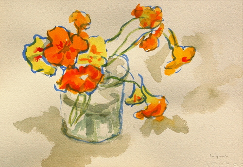
Nasturtiums, September 18, 2009, watercolor, 8 1/2 x 12 1/2 inches
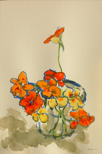
Nasturtiums, September 20, 2009, watercolor, 12 1/2 x 8 1/2 inches
I stopped to compliment a neighbor up the street on his garden, and I came home with a bouquet of nasturtiums. These are rather special nasturtiums, though - they came from seeds pilfered from Monet's garden at Giverny. In the fall, nasturtiums grow seed pods, which dry and fall off by the thousands when you get enough of them together, so my neighbor discretely scooped up a handful as he was tying his shoes. These aren't the standard flat orange variety - they're painted with crimson and range from citrus orange to pale yellow.
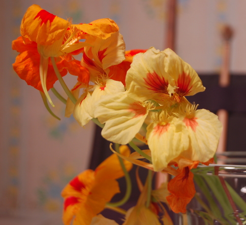
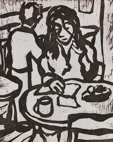
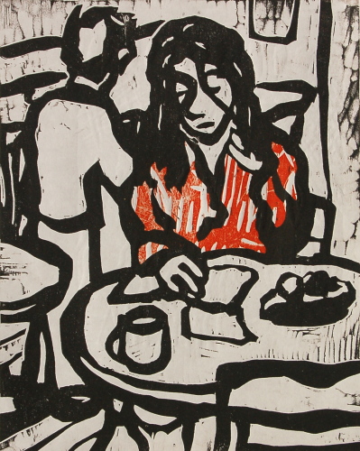
Supergirl: Nasturtiums, September 2009
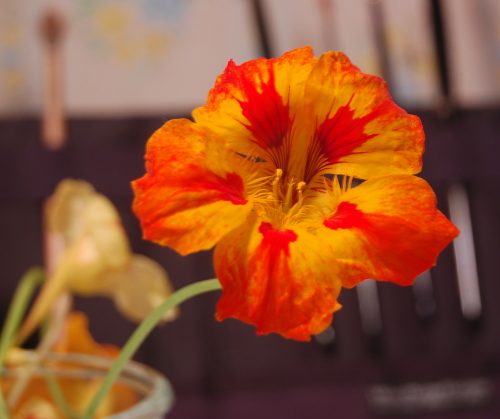
Supergirl: Nasturtiums, September 2009
Today I tried taking photos of the watercolors using my new lamps, but one of the 500-watt bulbs, which make me feel like my skin is crisping off if I get near them and cause the light switch on the wall to make a brief but disconcerting sizzling sound when I turn them on, burned out after 28 minutes of use. It was cloudy all day until we got a break at 4 PM. Was it light enough? Judging by a shadow, the sun was coming in at 35 degrees to the ground. The results were good enough to put up on the blog, but I'm going to try again with fresh bulbs rather than deem these portfolio-worthy.
While I was shooting, I thought I'd dig out the prints I did with Annie Silverman at MassArt this summer. I don't consider these portfolio-worthy, inherently, but I did find out that relief printmaking rather suits my drawing style. Annie has a decidedly non-purist attitude about printing, which suits me fine. The red in the second image was made by throwing the print down on another block of a wholly different size with a plastic mask, with a hole cut in the shape of the shirt, between them.
Hopefully I'll get some better work out of the workshop I'm doing with Annie Bissett at Zea Mays this weekend. My namisei set has arrived.
2.
September 24, 2009, 7:04 PM
Very nice work and, hey, they tie back to Monet. Can't beat that.
I've been thinking a lot about flowers in painting lately, seeing work by Matisse or Walasse Ting with a lot of flowers in the background. I don't know if their houses were always full of flowers but my house sure ain't, so when I tried the other day to pretend and invent some flowers for a background I just couldn't bring myself to do it.
The hostas have been in bloom all around the neighborhood, mostly a nice lavender kind of color, and I've been thinking of how to capture that, except my oils are all in Brooklyn. Watercolors? Pencils? Watercolor pencils?
By the time I figure it out it'll be dead winter. I never got to the magnolias I wanted to do last spring. Ah well, there's always next year.
3.
September 24, 2009, 11:20 PM
Ever try lift ground etching or lithography?
4.
September 25, 2009, 1:14 AM
I'll second the line weight comment. Nice color. Makes me smile. With this varietal, you really are copying nature.
5.
September 25, 2009, 6:16 AM
Arthabit - neither one, and I ought to give both of them a fair shake one day.
Thanks to all.
6.
September 25, 2009, 7:58 AM
So Franklin, are these flowers related to Lucille Ball? Very technicolor (I mean the originals in the photos). Your first (top) WC of them is the better one of the two, but nice as the color of the flowers is, I find myself more interested in the water cup and the background shadows (and of course, how those elements contrast with the flowers). Lovely.
7.
September 25, 2009, 8:40 AM
all so beautiful...how lovely to see your work and the blog...we all need neighbors with flowers like these and your skill to capture them Beatricia Sagar
8.
September 25, 2009, 8:50 AM
Spanky pictures, Franklin.
What I want to know is, why isn't the plural "nasturtia"?
9.
September 25, 2009, 8:53 AM
i like the top one as well. the bottom one seems to be slightly overworked or not worked enough.
10.
September 25, 2009, 9:42 AM
Some Googling indicates the the plural should, in fact, be "nasturtia". But we speaka de Engleesh, so whatever works.
Just don't use the non-word "virii" around me.
11.
September 25, 2009, 5:44 PM
FWIW...At home on the Macbook it was hard to choose and I thought I liked the second one after much deliberation. At work on a bigger and brighter screen the first one is clearly the stand out.
12.
September 25, 2009, 6:04 PM
Chris, as long as you keep your virii to yourself, you can say whatever you want.
13.
September 25, 2009, 6:13 PM
Franklin, I assume the print is a woodcut, or something along those lines, right? Reminds me a bit of Masereel, but more sedate or languid. It has a rather interwar look to it, at any rate.
14.
September 25, 2009, 6:22 PM
It's a woodcut. Masereel's a big inspiration.
15.
September 25, 2009, 6:37 PM
I assume you've looked into Ernst Barlach, who led Kollwitz to woodcuts, though she later switched over to lithography.
1.
opie
September 24, 2009, 6:51 PM
The flower paintings are very fresh and elegant. Great color. They really struck my eye. I think the thinner line is a real improvement.