Birth of the Cool
Post #1075 • October 17, 2007, 12:23 PM • 36 Comments
Newport Beach, CA - Few shows I've seen to date have been so simultaneously enjoyable, edifying, wide-ranging, and full of serious work as Birth of the Cool, currently up at OCMA. The show studies a cross-section of art and design generated in Southern California in the 1950s, from paintings by neglected masters of the California Hard Edge movement to clips from the Hollywood animation studios. Consequently, one gets to draw stylistic comparisons between, for instance, Eames furniture, Gerald McBoing Boing, and the Flying V.
This is great fun, but the juiciest part is those Hard Edge painters. Birth of the Cool invokes a 1959 exhibition at the Los Angeles County Museum called Four Abstract Classicists, which featured the work of Lorser Feitelson, John McLauglin, Karl Benjamin, and Frederick Hammersley. For good measure it throws in Helen Lundeberg, who was married to Feitelson and whose Sloping Horizon is one of the strongest paintings in the show. McLaughlin, who went to Japan in 1935 and afterwards ran an Asian art gallery on the East Coast, eventually (in his forties) started painting and moved to Dana Point. His works synthesized the Japanese aesthetic into a kind of proto-minimalism, and they are somber, understated, and gorgeous. Hammersley is still painting out in Albequerque, where he resettled after leaving Los Angeles in 1968. (He had come from Salt Lake City to study at the school that would become CalArts.) I kept returning to the Hammersleys, whose luminosity, subtle texture variations, and compositional sweetness insisted on jumping out in front, although on one of the Karl Benjamins, pictured below, was a ringer.
Karl Benjamin: Black Pillars, 1957, oil on canvas, private collection, © Karl Benjamin, courtesy of Louis Stern Fine Art, West Hollywood
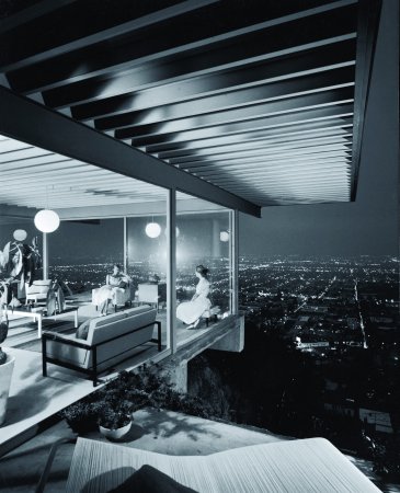
Julius Shulman: photograph of Case Study House #22 (Pierre Koenig, architect, Los Angeles, 1959–60), 1960, © J. Paul Getty Trust, used with permission, Julius Shulman Photography Archive, Research Library at the Getty Research Institute
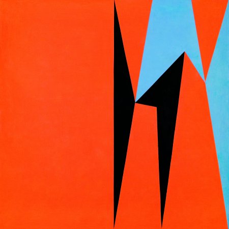
Lorser Feitelson: Dichotomic Organization, 1959, oil on canvas, 60 x 60 inches, Nora Eccles Harrison Museum of Art, Utah State University, Logan, Utah, Marie Eccles Caine Foundation Gift, © Feitelson Arts Foundation
2.
October 17, 2007, 1:56 PM
In front of one of the Hammersleys, this conversation ensued:
F: That's what I was trying to do with those flat paintings.
Supergirl: So why did you put people in them?
F: I dunno! It seemed like a good idea at the time.
3.
October 17, 2007, 3:37 PM
Karl Benjamin Rocks!
4.
October 18, 2007, 8:29 AM
My problem with almost all the hard-edge draw & fill artists who came out of the 60s is their color.
Just about all of them - with the notable excetion of Kenneth Noland, who is a color magician - just took black and white and primaries and slammed them on with little regard to color relationship, as if the daring act of geometric hypersimplicity was enough. Most of them also showed little imagination with the organization of space.
The "Op" artists got a little more interesting, but that stuff looks pretty gimmicky now, despite its recent surge in popularity.
5.
October 18, 2007, 10:14 AM
This stuff looks very much of its time, but now feels dated. The Feitelson shown reminds me of a "progressive" 1950's record album cover for something like Stravinsky (with bad color, as OP notes). It's all interesting enough, especially relative to current work, but that's not saying very much. Sorry, Franklin, but I don't share your enthusiasm.
6.
October 18, 2007, 10:52 AM
[Is "no ads" not adequately clear? Jeez. - F.]
7.
October 18, 2007, 4:15 PM
I like those things, the Benjamin more than the other. Just like I like most Formica patternes from that period. Sort of like I like old photographs. I'd love to live in the house, too. Beats my plain jane walk out ranch.
These are not players for the big leagues, of course. But minor art has its rewards and there are more than a few here.
Eames furniture, when it hits, hits big time, though. I have the lounge chair. Take away the troublsome ottoman (for which I paid extra, butnow keep in another room), and it is a wing-dinger of a place to plop my fat Mississippi flathead butt every night to soak up rays from my new fangled LCD TV.
8.
October 18, 2007, 4:41 PM
I like the anecdotal comment, catfish. Like it better than an analogy anyday.
And I kinda like the Benjamin image. I kinda like it quite a bit.
9.
October 18, 2007, 4:49 PM
They are of their time, but I find that the good ones grow on you. I wish I could have gotten images of some of the Hammersleys.
10.
October 18, 2007, 5:09 PM
Alleged Frederick Hammersley paintings that allegedly look like Franklin's.
12.
October 18, 2007, 5:25 PM
The Benjamin's apparent appeal is probably related to its echoing of Matisse cut-outs. I will not add the obvious.
13.
October 18, 2007, 5:58 PM
Benjamin appears to be the conduit for the influence of the ever flexible and always relevant boomerang shape, Jack. If you can't see a boomerang somewhere, it ain't from the fifties.
The boomerang shape is the armature around which 50s cool was built. Miro for those who lived in warm sunshine and happy thoughts without any desire to reveal the awful truth about anything.
As Yogie Bera might have put it, the 50s were a time of low strife for those who didn't expereince a lot of strife, and that warm glow persists in Benjamin's sutff.
"I like Ike" anyone? At an opening earlier today I said to someone "why doesn't anyone paint pictures of pretty petunias anymore?"
14.
October 18, 2007, 6:20 PM
The problem, Catfish, at least mine, is that this stuff strikes me as more or less the artistic equivalent of Formica. It does have a certain charm, a certain guileless optimism, perhaps, but it's thin, shallow and rather plastic (or so it feels to me). And OP is generally right about the color.
15.
October 19, 2007, 2:53 AM
Well Jack you know I love the take-no-prisoners attitude you carry into your encounters with art. But I am a bit more relaxed when I don't sense the ambition to be major, and I don't sense it in this stuff. There is a lot of pleasure to be had from minor art. I much prefer the good minor stuff to the wanna be major things that flop off the wall like the dead fish they really are. Clem wrote about the plenitude of bad "exportable" (would-be-major) art in his intro to the essay on Louis and Noland. The corollary to that point is that good minor art beats the bad "major" stuff hands down.
The problem with minor art is that many take the term "minor" as an insult and that blocks their way into the joy it porvides. I don't see it as an insult, just another of art's many modes of existence.
16.
October 19, 2007, 9:08 AM
McLaughlin, Hammersley, Feitelson and Benjamin are all in the massive "New American Painting 1950 - 1970" by Claudine Humblet, discussed here a few weeeks ago.
17.
October 19, 2007, 10:30 AM
What's better?
a. a good design?
b. a good smear?
18.
October 19, 2007, 10:44 AM
All right, Catfish, but all minor art is not equally minor, or minor in the same way. This particular example happens to strike me as more lightweight than others.
19.
October 19, 2007, 2:51 PM
This question is directed at Catfish and OP, but anyone else may respond as well. What do you think of the work of Nicolas de Stael?
20.
October 19, 2007, 4:27 PM
Respectable but anemic.
21.
October 19, 2007, 7:17 PM
deStael looks ambitious but doesn't take it home.
22.
October 19, 2007, 8:12 PM
Back in the 50s de Stael was superhot, the next Big Thing in French Art, which everyone assumed was where it was at anyway. I think he died young also, and that helped.
23.
October 19, 2007, 8:39 PM
1914-1955
24.
October 19, 2007, 8:48 PM
Well, maybe I'm a snob, but if I'm going to look at a minor painter from the 1950s, someone like de Stael is of more interest than the cute-and-perky work pictured in this post. I agree that failed ambition is vaguely depressing, but stuff that makes me think of dated album covers just bores me.
25.
October 19, 2007, 11:24 PM
I have no doubt you are an "art snob" Jack. That's what makes you so interesting.
I'm not sure deStael is a minor painter. Seems more like a failed major painter to me, if such a thing makes sense. But if you like him you like him, no matter what he is.
26.
October 20, 2007, 5:42 AM
De Stael did what he did better than other French modernists of his vintage. He had a nice way of abstracting landscape, and his color was pretty good. Also he "painted well" - had a knack for laying the paint on the canvas. I would compare him to some of the American artists of the AE period who were excellent painters but didn't pull level to the dozen or so best (but look better and better in the face of what we have now).
And yes, I certainly would prefer his paintings to the California minimalists. I find their work respectable and serious but the color is ogten sour & lifeless and they don't make enough of the combinatory opportunities the flat minimal fiormat afforded.
28.
October 20, 2007, 8:06 AM
Nice poster, 63.
29.
October 20, 2007, 8:15 AM
Nicely summed up, OP (#26). That's pretty much how I feel. I've seen fairly few things by de Stael in person, mainly at Basel outings, but they definitely "look better and better in the face of what we have now." I suppose I may have been unduly impressed, given the very unimpressive stuff all around them at the time, but I'd rather watch someone like de Stael fail than see a number of other people "succeed."
30.
October 20, 2007, 8:31 AM
De Stael tends to look like failed Morandi to me, sort of like Morandi without the formal pressure.
31.
October 20, 2007, 9:34 AM
[You know, I don't think this comment added enough value to this discussion. - F.]
32.
October 20, 2007, 10:04 AM
You're Mean enough, but certainly not Golden, 1.61.
Sounds like you wannabe an art critic. Good luck.
33.
October 20, 2007, 10:27 AM
Attempting to tell others what to discuss and how to do so is not only inappropriate but useless, not to say counterproductive--except, of course, in a totalitarian system, where that is the norm enforced through fear. If I won't take direction as to evaluating art, I most certainly won't take it regarding how I choose to talk about it.
34.
October 21, 2007, 7:24 PM
deStael:
He is good. There were some beautiful little paintings in a show I saw in Paris last year, L'Envolee Lyrique, a strange, and great survey of French art 40s-60s at Le Petit Senat. I agree with the 'failed major artist' assessment but don't even know if he failed. What is he supposed to win.
Bernard Buffet?!
French art fascinates me more and more.
What are the surfaces on these works like in Birth of the Cool? Also what are thoughts on Paul Feeley? Work like this, posted recalls his--his is more spare though, so appears less anxious. When I think about your figures, that's why I think you put them in, Franklin--to convey the whole of a situation with the most minimal means, challenging the overt applications and compositional solutions of the earlier work with a different complexity.
35.
October 21, 2007, 7:41 PM
Probably just regular oil paint surfaces, painted flat, EC
36.
October 21, 2007, 7:49 PM
The Hammersleys were surprisingly nuanced. Some of the areas had been noticiably scraped, while others were painted flat. The Lundebergs had just enough medium going so that they registered a little fuzzy at the edges. Even the above Feitelson had brushy areas in it, to its credit. The Benjamins were dead flat.
1.
ahab
October 17, 2007, 1:33 PM
A goodly portion of the Hammersleys I found by googling look strikingly similar to your own recent paper collages and hard-edged acrylics, Franklin. Did they provide you with any "ah-ha"s or provide solutions to any problems in that arena?