Previous: Questions for Mark Golden (1)
Next: North Adams miscellany (16)
Bannard at Jacobson Howard
Post #1011 • May 29, 2007, 2:58 PM • 26 Comments
Manhattan—Thoreau once said that no man ever followed his genius until it misled him. It could be true, or at least unfalsifiable, if we distinguish between following it triumphantly and following it with our stumbling human feet. I think most of us are forced to do the latter, if even that. Today I put up two essays in which Walter Darby Bannard recounts what it's like to be an artist, and there is a common theme in them - you spend a lot of time in a state of unknowing, and that state is confusing and painful to the degree to which you have preconceptions about what is supposed to happen with your work. And yet, with not even a vague initial idea about what to work on, you would never create anything. What distinguishes a conception from a preconception? It's a tough problem.
Pace Thoreau, I believe it's a problem you can only solve by traipsing down a few garden paths. The simple paintings that Bannard made in the late '50s and early '60s, several of which are on display at Jacobson Howard, speak of a certain amount of misplaced seriousness, but not so misplaced that it didn't result in some handsomely austere successes. If they didn't inform his later work except as such things often do in an artists life - by using up a line of inspiration, which finally dies, and mulches into the loam that nurtures future bursts of inspiration - they significantly predate work executed afterwards by self-described minimalists and artistically exceeds most if not all of it.
The best of them glow by sheer force of color combination, taking advantage of the effect described astutely by Clement Greenberg that more blue is bluer than less blue. The larger ones are person-sized, and they envelop the viewer in their expansive simplicity. The smaller ones are engagingly odd, particularly one built around a shape that seems to have been traced from a clothes iron, evincing something like dry wit. They relate stylistically to contemporaneous works by Frank Stella (who attended the opening), but are lighter in tone both in color and emotion. Although no expert, I concur with Walter Robinson that they're a bargain - Bannard has continued to work unabated since then, and he is producing paintings with luscious, fluid shapes and striking palettes. As Bannard wrote in 1976, "There is something about this art which demands time, a long apprenticeship." Having served that apprenticeship, it's not inappropriate to refer to him now as a master.
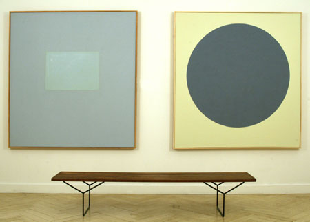
Walter Darby Bannard: Blue Parlor (also Ivory Parlor), 1960, alkyd on canvas, 65 x 62 inches; The Marriage #3, 1961, alkyd on canvas, 65 x 62 inches. Installation view, Jacobson Howard Gallery.
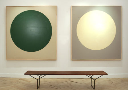
Walter Darby Bannard: Pine #1, 1961/62, alkyd on canvas, 63 x 62 inches; Zeno, 1960, alkyd on canvas, 65 x 62 inches.
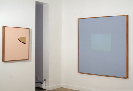
Walter Darby Bannard: Fast Iron, 1963/64, alkyd on canvas, 31 x 33 inches; Blue Parlor.
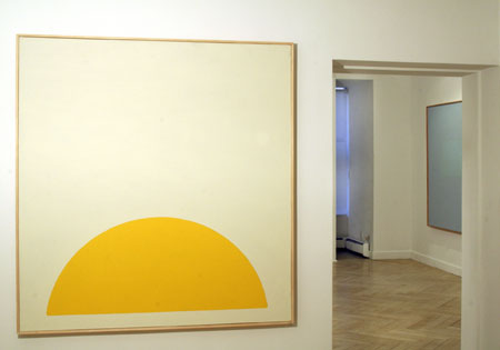
Walter Darby Bannard: Yellow Rose #1, 1963, alkyd on canvas, 65 x 62 inches.
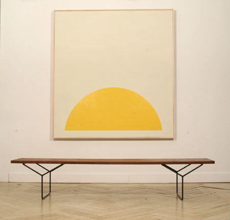
Yellow Rose #1.
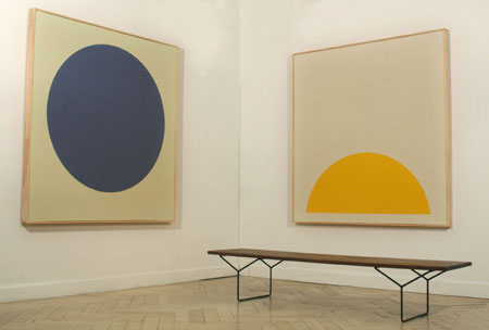
The Marriage #3, Yellow Rose #1.
2.
May 29, 2007, 5:16 PM
Thanks for this. I appreciate it. I was about to write how nice it was of you to post this, but then I remembered saying the same thing to Clem Greenberg in 1963 when he put me in the Post Painterly Abstraction show and he growled "I'm not trying to be nice!". It took me a minute to understand that I had implicitly criticized his objectivity.
But still, I do appreciate it, and the excellent text. Thanks. The "mulching into nurturing loam" is true and well observed.
3.
May 29, 2007, 5:23 PM
Wonderful. Much better than all the Warhols made short after and with a much greater efficiency. What a drama ;-))
4.
May 29, 2007, 8:15 PM
im a sucker for this minimalist stuff. love the craft and the clean lines. its a dead end road though, somethings gotta give. too much classicism not enough soul.
ellsworth kelly, brice marden, ryman, stella, a. martin...good stuff!
i ate this stuff up.
what i find more interesting is bannards change of heart.
5.
May 29, 2007, 8:21 PM
beWare: too much classicism not enough soul
To the extent minimalism is about clarity and directness, it is the soul of modernism.
6.
May 29, 2007, 8:53 PM
Mimimalism is the "soul of modernism" only if one carries Greenbergian thought through to its logical conclusion.
7.
May 29, 2007, 9:40 PM
It is never a matter of thinking, just looking. If you don't see it, that's ok in the sense that there is nothing I can do about it. If you can, there is no need ...
8.
May 29, 2007, 9:47 PM
MINIMALISM IS NOT THE SOUL OF MODERNISM.
9.
May 29, 2007, 10:06 PM
...only if one carries Greenbergian thought through to its logical conclusion.
Well, where else would you carry it?
10.
May 29, 2007, 10:11 PM
And your point being???
11.
May 29, 2007, 10:59 PM
Funny, I called the gallery today to find out how long the show was up and can't wait to go see it. The disparity between the old and new work is fascinating, though, they seem to be vertiginous, standing at the precipice of color and falling inward, almost like the space of falling into a dream. But, this impression derives from screen images so it'll be another experience encountering the actual work.
These look like paintings made in New York, or Boston--not in Miami.
Environment is a major factor in an artist's work.
One thing that puzzles me is the table...(s). They seem deliberately placed, as if to level the eye from one transition to another, acting as the back crust on the pie shape Franklin calls an iron. But, could it be?
A visit is in order. And what a fiesta! This exhibition, then down to 57th for Myron Stout, Chas Burchfield for a touch of rococo...and in betwen, Monet...head spin!
12.
May 29, 2007, 11:02 PM
Clarification, both sets of work have a sense of vertigo, is what I intended to express.
That is where I would see a connection between the bodies of work.
13.
May 29, 2007, 11:36 PM
And your point being???
Well, perhaps it would appear that I was agreeing with you... you silly wang.
14.
May 29, 2007, 11:56 PM
The paintings were made & shown in NY, ec. Many years ago.
I missed Burchfield when I was in NY. Too bad. Good stuff.
Try to see the Monet show at an off time; I hear it is jammed. Call the gallery. It is a hell of a show.
15.
May 30, 2007, 7:17 AM
I saw it. Last year I visited Giverny, l'Orangerie (newly refurbished) and the Marmatton Monet in Paris. It was earth shattering, returning me to my first encounter w/ Monet at the LA County when I was a kid. (Interestingly my first encounters with art were Monet and Frank Stella's Protractor at Pasadena Museum of Modern Art run by Hopps at the time).
So the circle of paintings in the Marmatton shattered any thoughts or illusions I'd ever had about Monet. He is genius. Post-haste I rushed to Wildenstein. The third room is the best, and the painting downstairs. I often find Monet scabrous, but when he floats, he's amazing. I love when he punctures the surface with marks of paint that move into the image, but stay outside of it as well.
In the second room (middle) there was a landscape study, of water, bridge -- with slashing umber marks up front and a setting sun. Pink, orange, umber darks. What an amazing study.
His lineage also became clear: surely, Joan Mitchell, but the tie to Jennifer Bartlett's work snapped into place as well. People dismiss Bartlett but I have always been interested in her epic installation-based work.
16.
May 30, 2007, 11:16 AM
I have a question after reading Bannard's essay on the seminar: why did he choose academe?
17.
May 30, 2007, 11:46 AM
Tenure, Benefit, a regular paycheck and painting as part of the job. Why not?
18.
May 30, 2007, 1:15 PM
I'm curious to know what happened to the young lady from the University of Texas described in Bannard's first essay above. It said she went to New York in the 1970s and adopted "everything that was making it, all of the cliches of the art world." It concluded, "she's got a lot of time to work it out." I'm interested to know what's happened in the 27 years since the essay was written.
19.
May 30, 2007, 1:17 PM
painfully true about the artists state of unknowing. it is an unbearable feeling because SOMEthing is there but it is amorphous, with a sort of ache. but every inpiration does lead to the next to, as you say, nuture future bursts of inpiration.
20.
May 30, 2007, 1:57 PM
Last I heard, Hovig, she was the mistress of a very rich man and had not painted anything for years. That was about 5 years ago
21.
May 30, 2007, 4:03 PM
Captions added above.
22.
May 30, 2007, 5:41 PM
i saw the paintings in person and the best ones, which were of the large circle format, did "glow" with a secure calmness. very fresh looking.
other artists have done this simple 2 color circle format with mild differences in regards to the set-up before and after darby. although his slghtly raised off center composition (set-up) is important, it is his color which makes the biggest statement compared to those which have come before and after. most other artist's paintings of this style feel less whole and unsure. these paintings are about the color and you feel it.
23.
May 30, 2007, 6:45 PM
"other artists have done this..."
Who before?
24.
May 30, 2007, 7:37 PM
george,
yves klein's "disc bleu" and kazimir malevich's "black circle" . i think malevich may have done others and i want to say another russian constructionist, possibly albers or someone else i can't pull up at the moment. if i remember or come across them again, i'll drop it in here.
25.
May 30, 2007, 10:48 PM
Re #24: 1,
OK, that’s what I thought you might have meant, although I think Klein is a stretch.
At the opening. I remarked to someone that I thought these were very radical paintings for their time, and got the ‘Russian’s did it first’ response.
I can see the association with Suprematism but I think it is one of appearance only and limited to only a few of the earlier Russian works. For the most part the Russian paintings were compositionally more relational. In the middle to late sixties Malevich was popular and visible (at least with my peers at the time).
It seems to me that there is a very different program at work in the two artists paintings. In 1915 just establishing validity of the geometric shape in a painting, as an abstract or non-objective element, was a major break through. Almost all of the Suprematist paintings are compositional.
In 1965, suggesting this (circle on a square, etc) was all that was required to make a painting a painting was a reductive and anti-compositional stance. So even though paintings from the two periods might share some resemblance’s, well so do paintings of horses, or cows.
Curiously, the time relationships between Suprematism, Bannard’s paintings, and the present are symmetrical at 1915-1960-2005 or about 45 years apart. I find this interesting for a reason. It seems that it is about the time required for the opinions and prejudices of one generation to become exhausted. It allows a younger generation the ability to look at earlier work with a sense of awe and excitement as a source of inspiration.
26.
May 31, 2007, 10:01 AM
i agree with most of what you say george, except maybe to the degree that the "klein is a stretch".
they are definitely different, but i would guess, less so than a horse to a cow for someone looking for the first time.
1.
Blue Circle
May 29, 2007, 3:18 PM
From Artnet:
http://www.artnet.com/magazineus/reviews/robinson/robinson5-21-07.asp
Also from the Wayback Machine is Jacobson Howard Gallery with its show of Minimalist paintings by Darby Bannard from 1959-65, perfect circles painted on perfect squares. The card for the show features a painting of a blue circle slightly above center on a near square, called The Marriage #3 (1961) (back during the ten days that I was a devotee of Guru Maya, they told us to meditate on a blue circle) and another work titled Yellow Rose #1, which places a yellow semicircle at the bottom of the canvas, like a rising sun. The paintings are a bargain at around $35,000 each.
It reminds me of the art teacher in Daniel Clowes Art School Confidential who paints the triangles...long before anyone else was painting triangles.
Except here he paint circles....
These paintings are very thought provoking.
I like the blue circle much more than the green circle
It is much more circleish.
Blue circles are much more difficult to paint than green circles.
The blueishness is overwhelming.