Next: critical art writing (73)
rene barge
Post #629 • September 21, 2005, 4:11 PM • 15 Comments
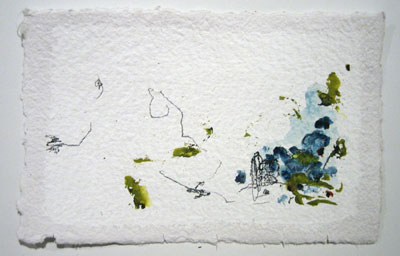
The line skips like a needle on a seismograph, detecting staccato pulses from deep within the earth. Occasionally it reaches an implosive frenzy and turns on itself, as if seeking to release its own mania. Lozenges of colors swarm together like honeybees. Paper, warm, touchable, white, provides a sprung floor for the dance, its texture joining the hum of activity.
Rene Barge: Gifts runs through October 1 at Dorsch Gallery.


2.
September 21, 2005, 6:45 PM
excuse my ignorance but if someone could tell me what the significance of this work is i would be truly grateful, im just not sure, it seems easy to dismiss but i dont want to, mabe theres something im not getting , please respond.
3.
September 21, 2005, 6:58 PM
I don't think it works like that, Jammed. You can't explain how beauty interacts with your being; you can only describe it. Perhaps this particular art doesn't work for you, or this kind of art doesn't work for you, or maybe art in general doesn't work for you. Without knowing which, I don't know how to answer, and there may be no answer in any case.
A simple explanation of abstract painting likens it to music without words or imitative sounds. The analogy fits well here because Rene also works with sound; he recorded some CD's, and painted their boxes. Sight, sound, and feeling interact in subtle ways, and Rene works in that area of subtlety that requires the viewer/listener to pay a lot of attention to those interactions.
Go see it in person if you haven't. It's good stuff.
4.
September 21, 2005, 7:21 PM
fair enough...
5.
September 21, 2005, 10:59 PM
These are quite small works which reminded me of haiku, or a visual counterpart to that. There was an Oriental element as well as a kind of minimalist AbEx element. I am speaking strictly about the visual aspect, which is how I experienced them. The cavernous space in which they hung, however, was not well suited to display them to best advantage, and neither was the ambient steamy heat (which we all hope will soon be a thing of the past).
6.
September 22, 2005, 12:09 PM
Barge's work is a big step down from a few pieces he had in the latest Dorsch abstraction show. Both have loosely painted surfaces and a certain casualness but the previous pictures have good color , surface, and composition. An example of the work I like is hanging in the office.
I liked the use of materials, text and composition in Andy's collage. They are clearly best in the show.
7.
September 22, 2005, 1:25 PM
Andy's work is the kind of thing MOCA should be noticing in terms of local talent but probably won't. It felt Russian to me somehow, like work from the Malevich era. Strong, bold, assertive presence with an interesting mix of clean lines and textural subtlety. It looked very good in that particular space, which suited it much better than the corresponding space suited Barge's work.
8.
September 22, 2005, 2:35 PM
Not surprisingly, I agree with Gravity and Jack.
Barge's abstract paintings are a different order of quality and seriousness from the "gifts", and Gambrell's constructions are damn impressive. I had not thought about the Russian Constructivist & design connection but it is apt.
9.
September 22, 2005, 3:27 PM
I think Andy Gambrell's work is allright. I'd like to see another show of his before making any more definitive statements, but offhand, the abstraction of the billboard portions and their arrangement works well, yet something about the surface/texture of the billboard material relates poorly to the wood-structure/frames. Additionally, it seems a little artificial for them to be confined to the wall; with just a slight push in scale they could be freestanding sculpture. I suppose that keeping them smaller enhances the distance from his source material, but I'm sure he could find a way to maintain that distance while increasing scale. More attention to the actual structure of his work may take him far, I think.
10.
September 22, 2005, 10:37 PM
Hello,
Franklin, thank you for the delightful reception towards my work.
Rene Barge
11.
September 23, 2005, 1:12 PM
Rene, taking comfort in Franklins comments won't help your work. If your serious you'll take a clser look at your paintings.
12.
September 23, 2005, 2:41 PM
Hello,
501F, your assuming that I am taking comfort in Franklins comments, I found his comments delightful and thanked him for it. Questioning my seriousness in the manner that you have is also an assumption, and if you took a closer look, you will find that the works are not paintings.
Rene
13.
September 23, 2005, 3:04 PM
Rene, your last line made me curious, but I live too far away to take 'a closer look'... what are these works, if not paintings? (sorry if this seems like a silly question). Do you mean to say they are actually drawings, or something else?... The Dorsch website doesn't detail the media used...
14.
September 24, 2005, 11:06 AM
Rene, I will guess that 501F was implying "think about doing more of those excellent paintings like the ones in the AIM show".
15.
September 26, 2005, 9:23 AM
Rene, I agree with Old Pro. The previous pictures are beautiful, so try doing more of those.
1.
George
September 21, 2005, 4:31 PM
so nice